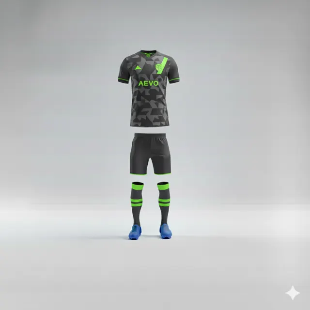
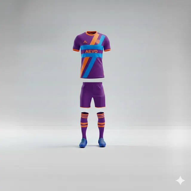
Use a simple colour and placement map in your design brief
Turn colour and logo instructions into a simple shirt-zone map. Help your team discuss placement clearly before requesting a design proposal.

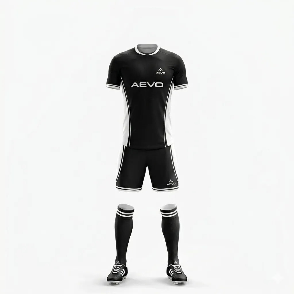
Replace vague instructions with a shared picture
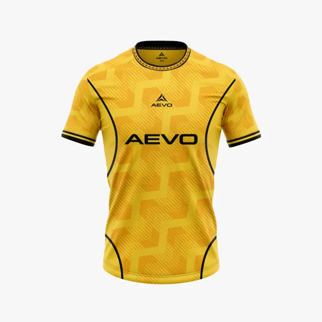
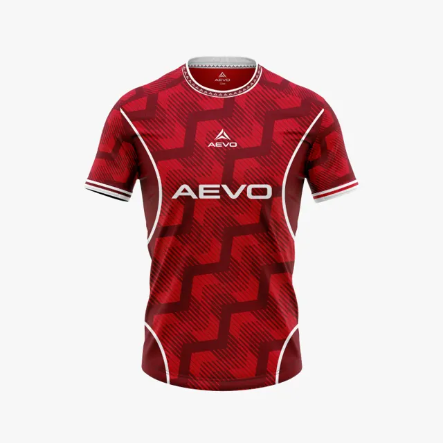
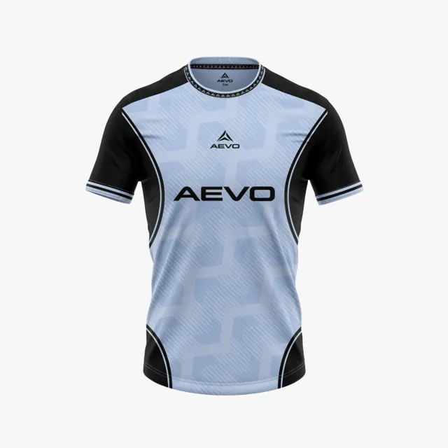
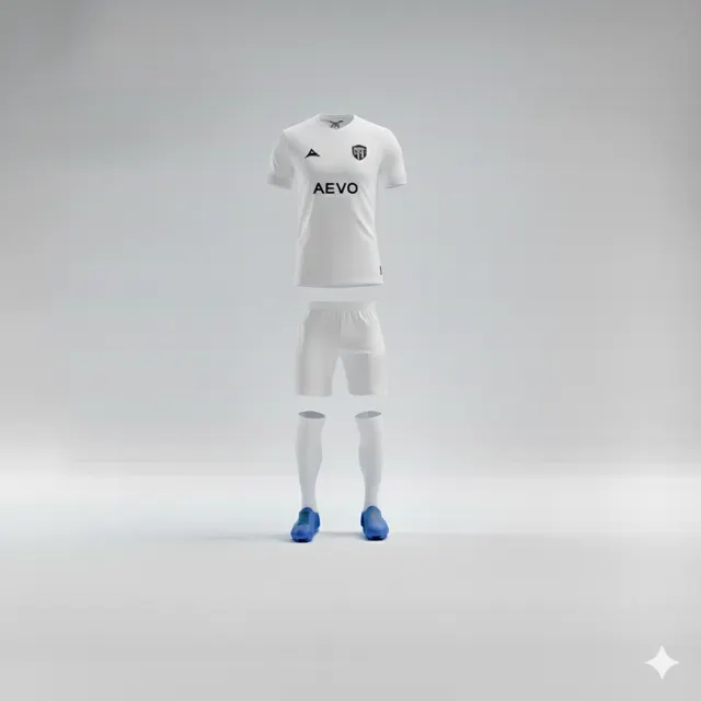
“Make it a little darker” or “move the logo higher” sounds clear to the speaker, but it can mean different things to everyone else. A simple colour and placement map gives the group a common reference. Draw a rough front and back of the shirt, mark sleeves and relevant panels, then number the zones. It does not need to look professional; its job is to show what area you mean and what matters there. Add a short note beside each mark instead of squeezing a long instruction into the drawing. Once assembled, compare the brief with the shape of available team kits and ask for a mock-up with fewer gaps for interpretation.
Describe colour as a relationship, not just a name
Write the club’s preferred colours using the names or references your group actually uses, then show how they relate: main colour, secondary colour, accent, and background for a badge or text. If the club has precise references in its identity guide, attach them and say where they came from. If there is no official code, include a picture or printed example but call it a visual reference, not a promise of exact reproduction. Screens and materials can show shades differently. The map should help the group discuss priorities, such as keeping contrast around a crest, rather than guarantee an exact hue. Also note combinations you want to avoid and explain why.
Place marks and messages in zones
Indicate roughly where a crest, sponsor logo, number or other text belongs, while distinguishing a preferred zone from a precise measurement. “Upper left chest” is often more useful than an estimated number of centimetres on a concept that is not final. If several marks need to appear, identify the most important and say whether any needs clear space around it. Confirm that the club has permission to use each logo. Competition or organiser requirements can also affect a design, so check the rules for the relevant competition instead of assuming a universal standard.
Make the map easy to review
Attach the same map to each design version and update it only when the group changes direction. A small legend helps: solid fill means a fixed choice, a dashed outline means a suggested zone, and a question mark means the team wants advice. Ask reviewers to refer to zone numbers rather than adding new vague directions. One coordinator can gather responses, mark decisions and send a single version of the feedback to the designer. When a mock-up returns, compare it with the map and ask about differences before assuming they are errors; some may be intentional. For next steps, contact AEVO and share the brief when requesting a design proposal or quote.