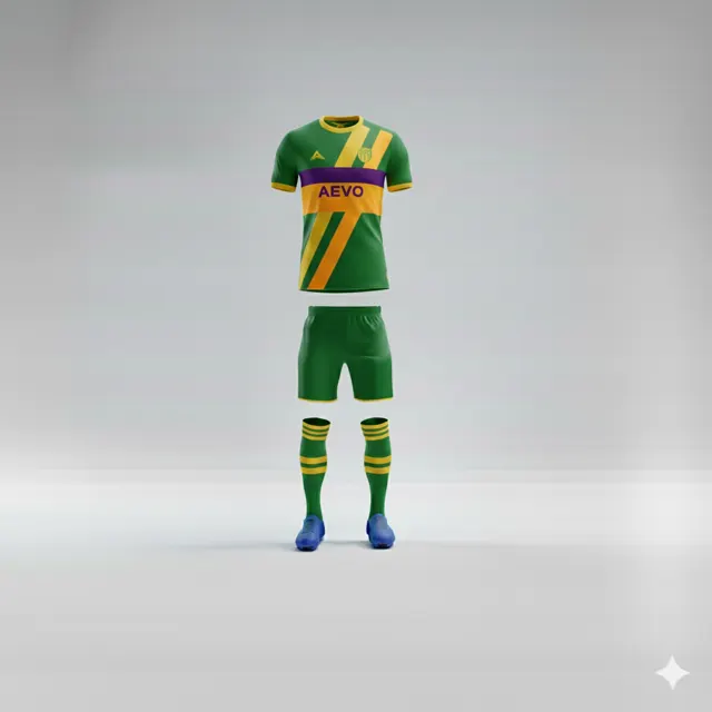
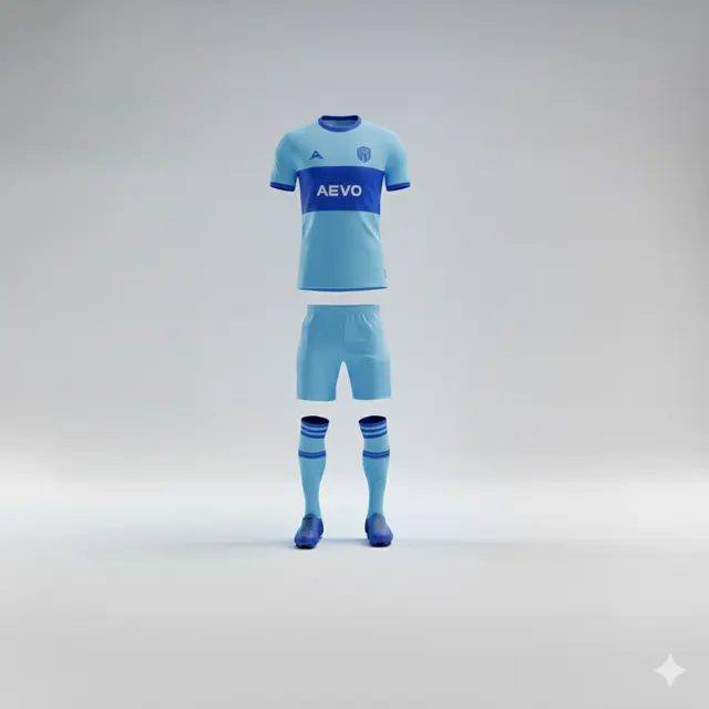
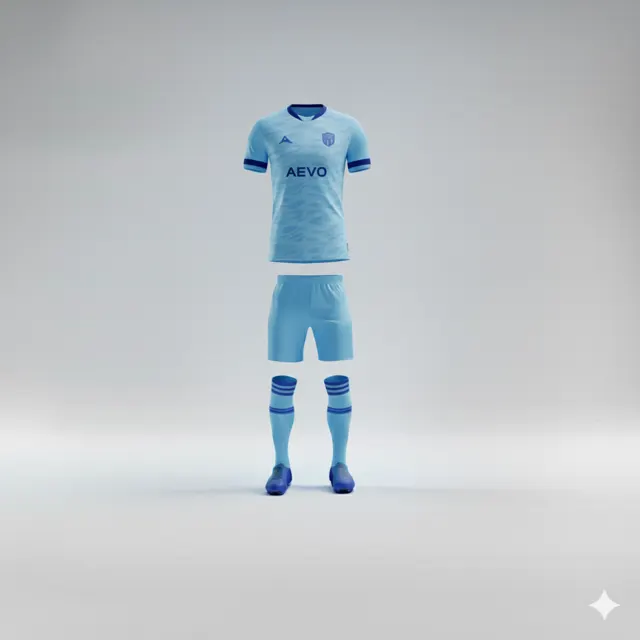
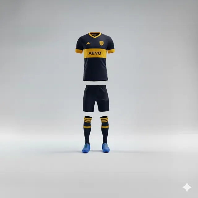
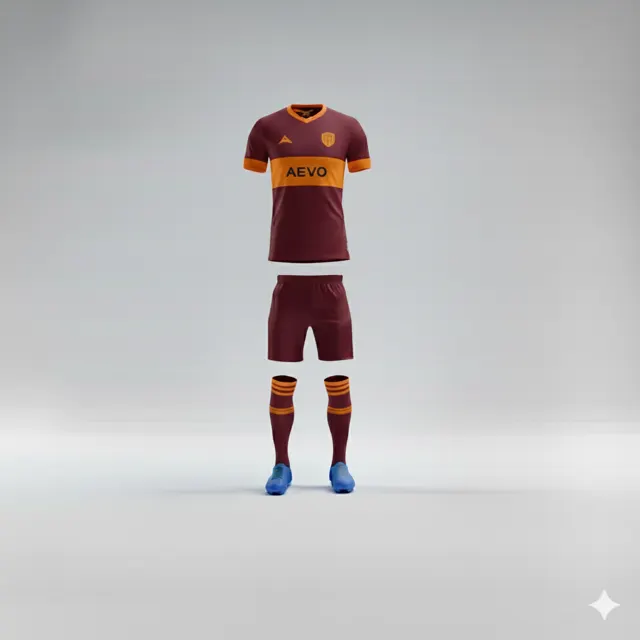
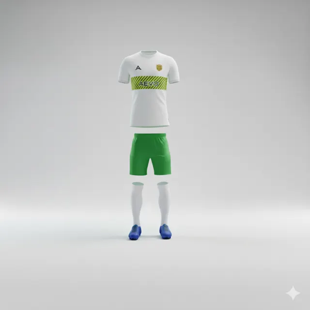
Questions to answer before choosing a football kit pattern
Answer five questions about visibility, club colours, crest clarity and use before selecting a pattern for your football kit.

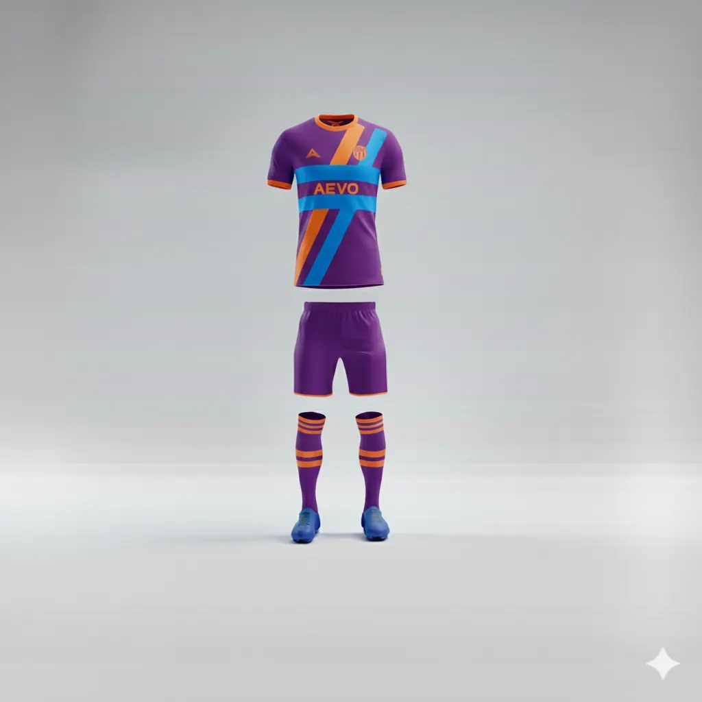
A pattern can make a shirt feel distinctive, but it should not be chosen only because it looks interesting in a small inspiration image. Before debating stripes, angles or tonal graphics, ask questions that make the decision practical. They help the club prioritise readability and identity over decoration.
What needs to be visible from a distance?
Think about what players, officials and spectators need to distinguish during a match. Is the crest, number, main colour or sponsor the element that needs the clearest contrast? A busy pattern near a number area can make the shirt feel crowded. Review the design in the view that best shows the relevant parts and judge large colour areas from a distance, not only fine details up close.
How does the pattern work with club colours?
Decide whether one club colour should dominate or whether the design should balance them. Similar shades can feel restrained; strong contrast draws attention. Start from the club’s actual colour identity and remember that an on-screen preview cannot guarantee an exact shade. If there is an existing away shirt, make sure the new design has a clear identity of its own.
Does the crest have a calm, legible background?
Do not automatically place the badge over the most complicated part of the pattern. Compare its size, contrast and background in the mock-up. The same applies to sponsor marks and personalisation: they should remain readable, while specific competition requirements must be checked with the organiser rather than guessed.
Will it work across garments and people?
If the design will be used on a shirt, shorts and perhaps training wear, ask whether it works with different cuts and panels. A concept tied to one exact seam may need adapting for another item. Consider whether the pattern feels right for the whole squad, not only the person who suggested it.
Can you explain the choice in one sentence?
If the group cannot explain how the pattern supports the club identity, it may be an unnecessary detail. Browse teamwear and use contact to ask for a proposal that balances pattern, crest and legibility.
Review the pattern in the conditions where it must work
Look at the pattern both as a small thumbnail and as a full garment, not only enlarged. Close up, line work is visible; at a distance, the overall contrast matters more. Ask several people to review the same view before hearing one another’s reactions. What did they notice first? Could they find the crest without searching? If answers differ widely, simplify the pattern or create calmer areas around key marks. Notice how the idea changes when the mock-up uses different base colours; a dark ground may alter the impact of an accent shade. This is a design review, not a promise of exact colour reproduction on the finished garment. Write down what should be tested in the next version so you can compare the change rather than restart the discussion.