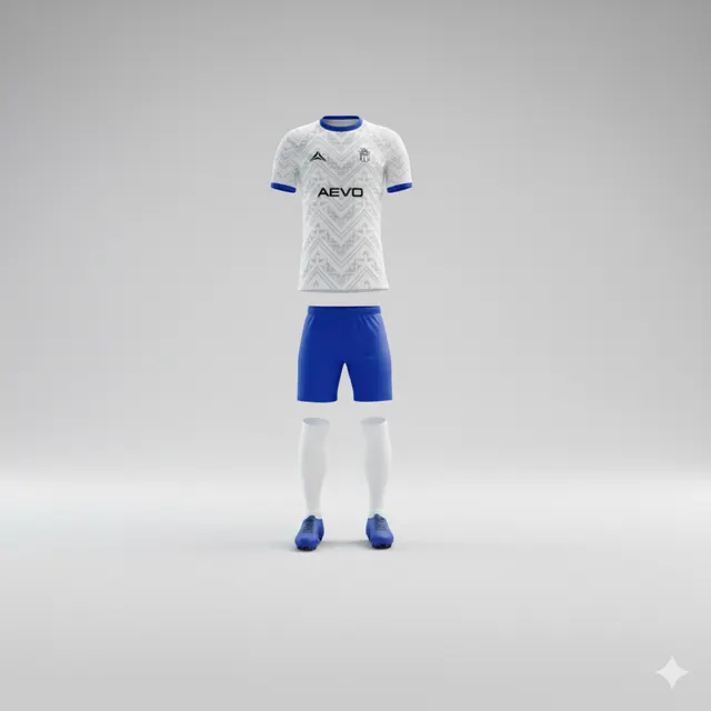
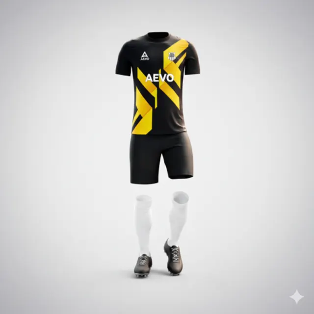
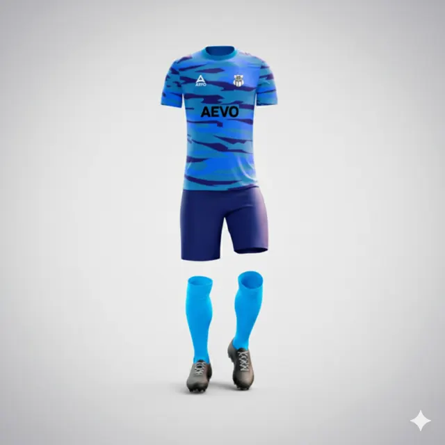
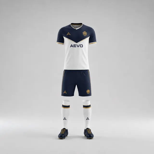
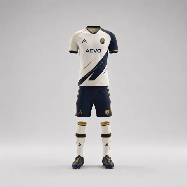
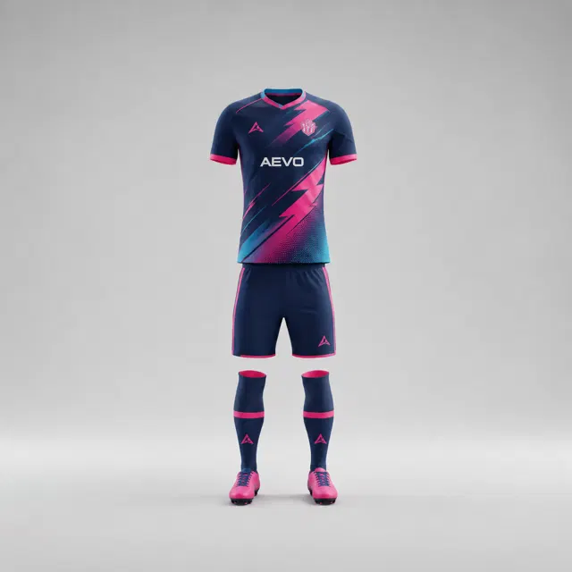
Keep an older club signature when the rest of the kit changes
Refresh your club kit while keeping the detail supporters recognise. Learn how to choose a historic signature and give it a confident new role.

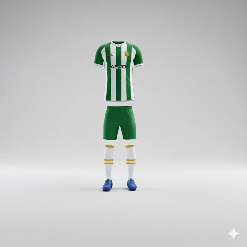
A new football kit can feel fresh without making a club look as if it has forgotten its past. One familiar stripe, colour placement or collar detail may carry more identity than an entire arrangement of old graphics. The design challenge is to preserve a meaningful link while allowing the rest of the shirt to move forward. Start with a conversation, not a nostalgic guess.
Find the detail people actually recognise
Gather photographs of several past kits, including examples remembered by players and supporters of different ages. Ask people what they would notice first if the club wore those shirts again. Then ask a sharper question: which single feature would they miss if it disappeared from the next kit? This distinguishes an enduring club signature from a fashionable detail that belonged to just one season.
Look for repetition over time. Perhaps a narrow contrasting band has appeared on both home and away shirts, or a particular secondary colour regularly returns around the sleeves. A feature does not have to be large to be recognisable. Conversely, an old sponsor arrangement may dominate a photograph without expressing the club itself. Keep the conversation focused on colours, shapes and placement that the club can own.
Let the signature evolve
Once the group has chosen a visual anchor, test how it could work in a new composition. A stripe might move from the side panel to the sleeve, become finer, or sit against a calmer background. A colour once used on the collar could appear as a restrained edge on the shorts. The point is to preserve the connection, not to reproduce a historic garment stitch for stitch.
Place an archival image beside a new draft. View both as small thumbnails first, as if seen across a pitch, and then inspect them close up. Can someone still spot the shared feature quickly? Does a new graphic compete with it? Does the shirt remain balanced when numbers, names and sponsor marks are added? A simple colour sketch is useful at this stage. Treat screen colours as design references rather than a guarantee of the eventual textile shade.
Ask for an unbiased read
Show the draft to a small mix of players, coaches and club members without explaining the exercise. Ask what feels familiar and what feels new. If people independently mention the chosen detail, it is doing its job. If they notice only a large pattern or sponsor, the signature may need more breathing room. Keep feedback specific: ask whether a line should be clearer, not whether the whole shirt is “good”.
Record the club’s reason for keeping the feature. A sentence such as “the blue shoulder line links the new shirt to our earlier home kits” gives the design group a stable test when opinions diverge. Browse different team kit options for ideas, and use the contact page to bring questions into a design discussion.
Approve the idea, then check the details
Before approving a final design, confirm the proposed placement and product options with the supplier. Ask how the feature is represented in the mockup and what adjustments remain possible. If your club wants a new look with a recognisable thread running through it, ask AEVO for a free design proposal or quote. A carefully chosen old signature can make a new kit feel distinctly yours rather than merely different.