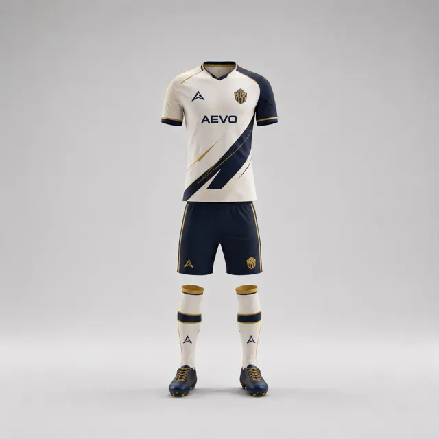
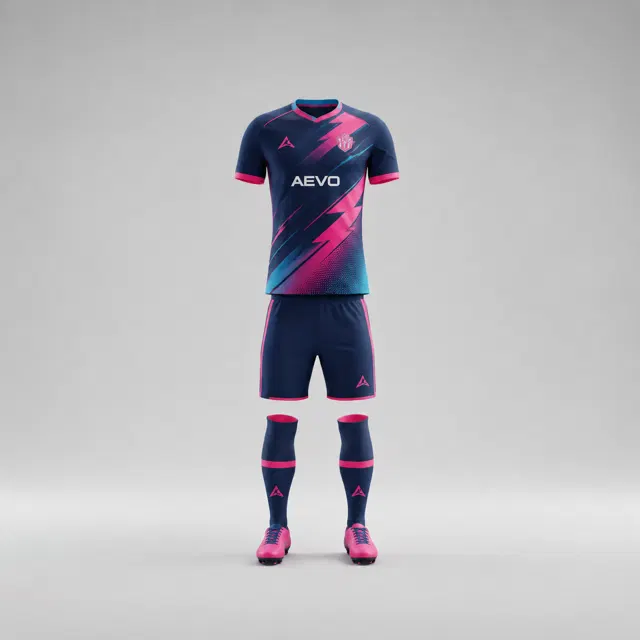
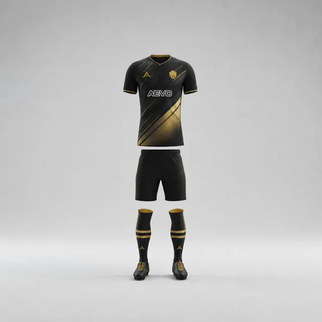
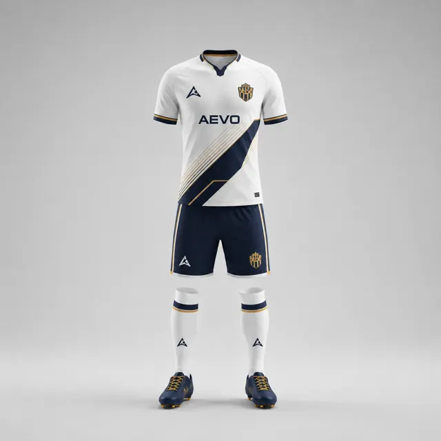
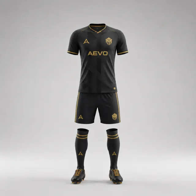
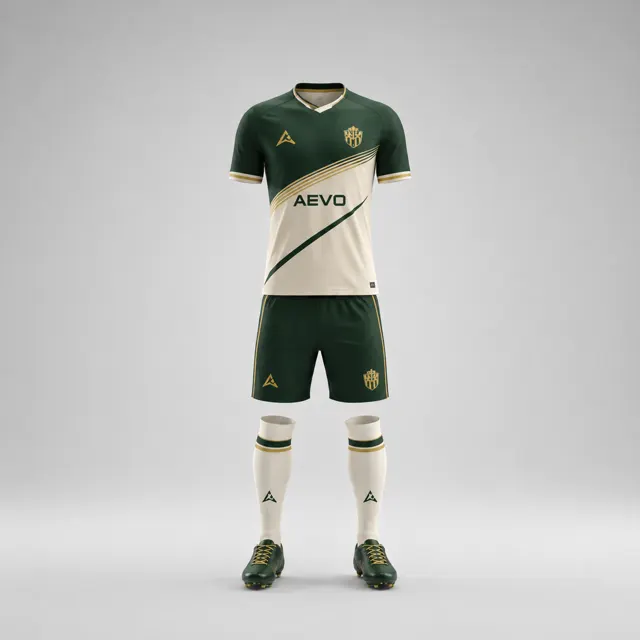
Choose name and number colours that read clearly on the shirt
Review name and number contrast against the shirt background in a mockup, without assuming that visual clarity guarantees competition approval.

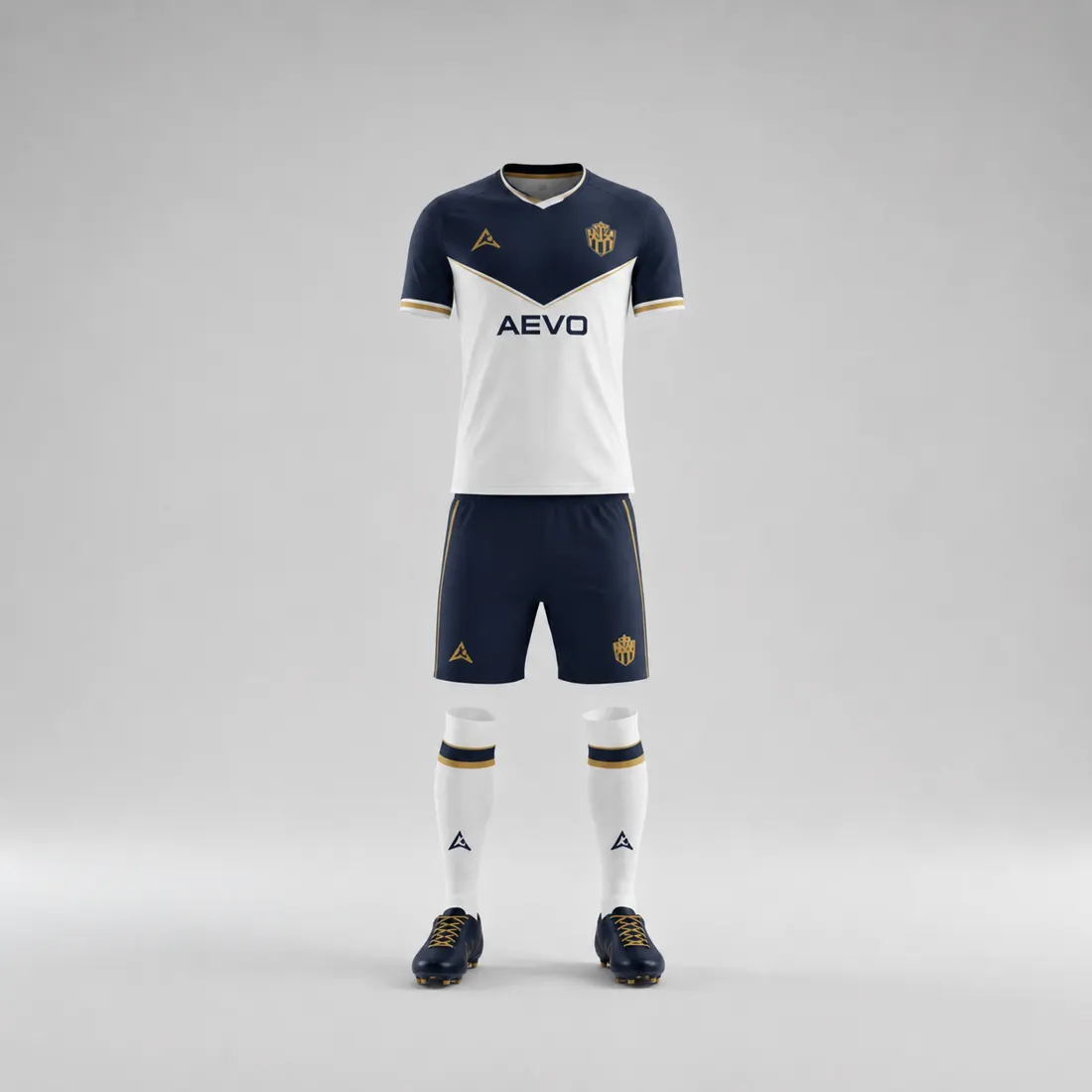
Names and numbers have a practical job: they should be easy to pick out against the area of the shirt where they appear. A colour that looks stylish in a palette can become hard to read when placed over a pattern, gradient or similar-toned panel. Review the lettering on the actual mockup, at its intended size and position, rather than choosing a number colour in isolation.
Inspect the real background
Start with the shirt design as it will be worn. Identify whether the name and number sit on a plain field, cross a pattern, or overlap a colour transition. Look at the entire outline of each digit and letter, not only the centre fill. Fine strokes and enclosed spaces can disappear first when the background is busy. If the shirt uses a moving graphic, check every part of the number area rather than inspecting one convenient spot.
Create two or three readable treatments while holding the shirt design constant. A light number on a dark field and a dark number on a light field are useful starting comparisons; an outline or backing panel may also be considered if it suits the design. Keep the crest, sponsor artwork and trim in the picture, because a number can have good contrast yet still compete with nearby elements. The custom kit page can help you frame the garment brief, and the gallery can provide layout inspiration without substituting for your own legibility check.
Check at match-viewing distance
View the design at full size, then reduce it to a small team-photo or fixture graphic. Step back from the screen and ask someone unfamiliar with the artwork to read the name or number. If they need to zoom, the contrast or placement deserves another look. You can also temporarily view a grayscale version: it helps reveal whether light and dark areas separate, although it does not assess colour accessibility by itself.
Avoid assuming that a thin outline solves every problem. On a complicated pattern, it can add visual clutter; on a plain field, a straightforward contrasting fill may be clearer. Test any outline at the real letter thickness. Likewise, a panel behind the number can create clarity but may change the overall look. The design should balance legibility with the club’s visual identity.
Treat the mockup as a design check, not a rulebook
A readable draft does not establish that the layout meets the rules of a specific league or tournament. Requirements can vary, so teams should consult the current organiser guidance when competition approval matters. Confirm the intended spelling, player-number assignment and artwork before submitting the design for production; the visual test cannot correct roster mistakes.
Write down the chosen number colour, whether an outline is included and what background it is approved for. This prevents later changes to the shirt pattern from silently weakening readability. If the mockup needs adjustment, mark the exact area rather than asking vaguely for “more contrast.” Send the notes to AEVO through contact and request a revised proposal or quote. A clear name and number treatment helps teammates, officials and spectators read the shirt without making unsupported claims about formal approval.