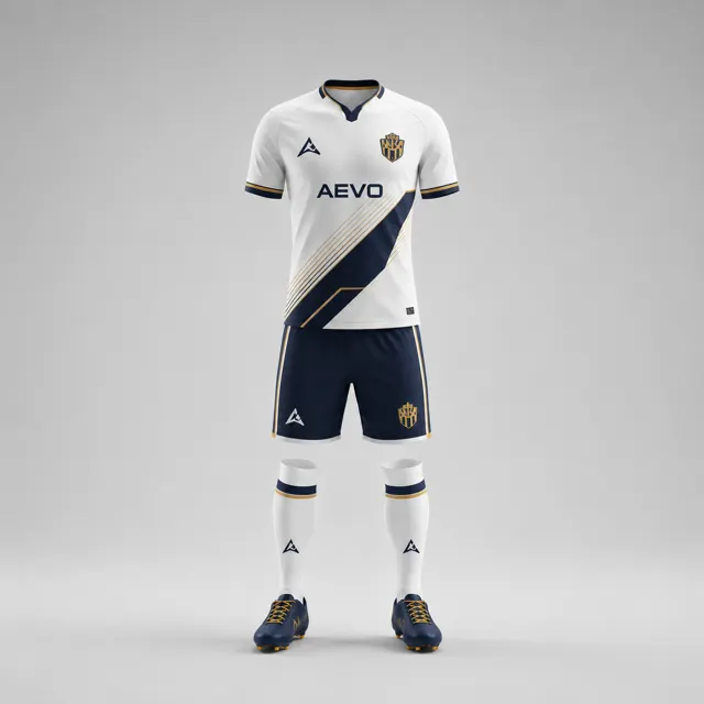
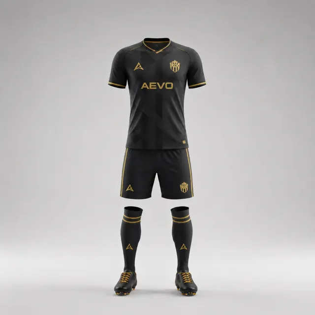
Choose an alternative colour when your favourite does not work
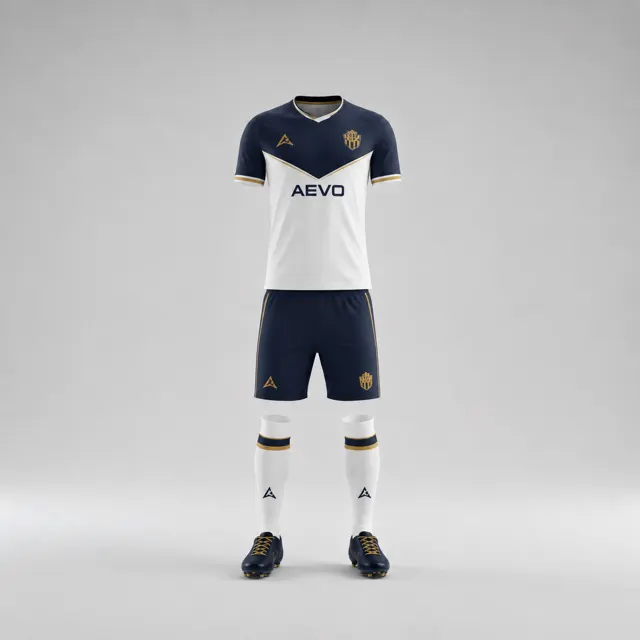
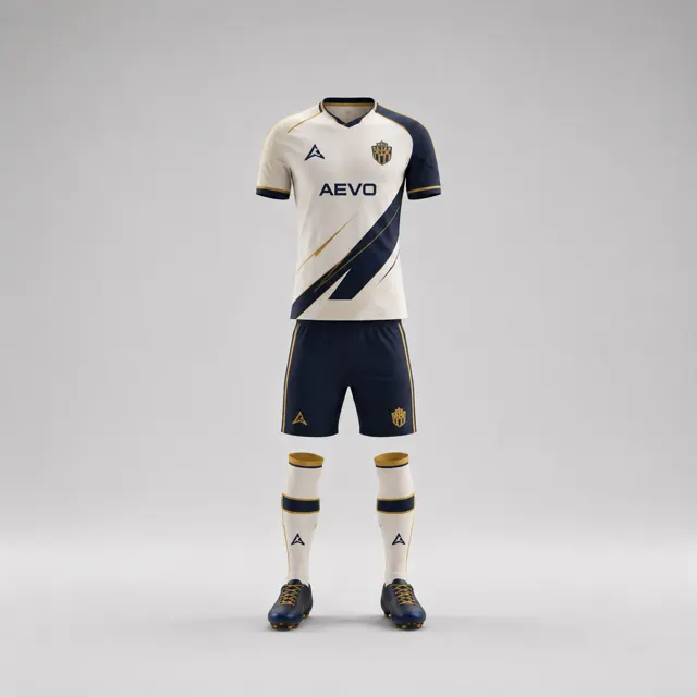
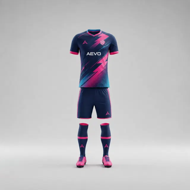
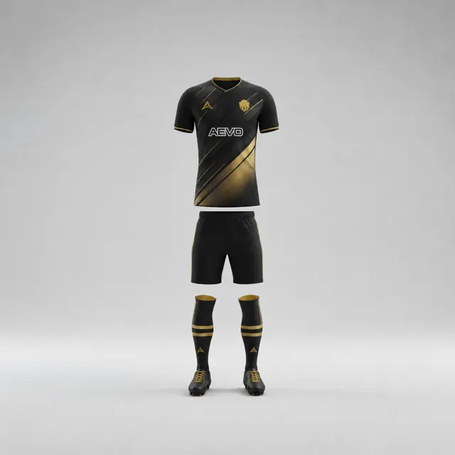
Build a thoughtful backup palette when a favourite colour clashes with graphics, the crest or the selected football kit style.

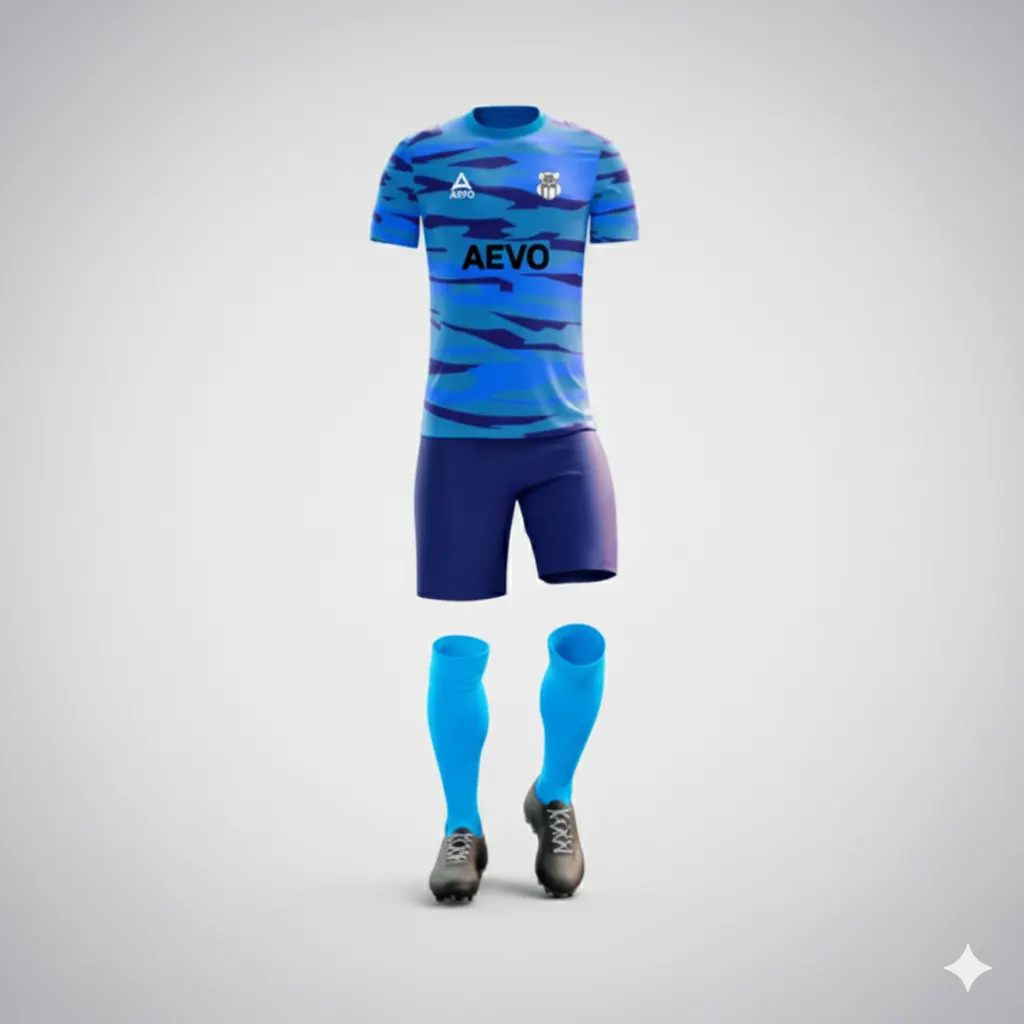
A club can start with one favourite colour and discover that it does not work on the chosen shirt design. Perhaps the crest loses definition, a graphic becomes hard to see, or the shade feels too heavy across the garment. Rather than forcing the first idea into every panel, develop a backup palette that preserves the intention behind it. The right alternative may be a different shade, a smaller colour area or a supporting colour promoted to the main role.
Identify what is failing
Describe the problem precisely before changing colours. Is the favourite too close to the crest background? Does a patterned panel compete with it? Does the garment model place a large area of that colour where it feels overpowering? Different causes call for different fixes. A contrast issue may need a new background or badge placement, while an unbalanced silhouette may only need less of the colour. Mark the troublesome area on the mockup so the designer can respond to the actual issue.
Keep the club’s identity reference beside the draft. The backup should not automatically erase a shade supporters associate with the team. Decide whether the essential part is the exact hue, a broad colour family, or simply the emotional quality it brings—such as energy, tradition or calm. Looking at the available custom kits can help frame garment choices, but the club should set the design brief.
Build a backup with a clear hierarchy
Try two routes, not a long parade of unrelated palettes. One can keep the favourite as a restrained accent and use a compatible supporting colour for the main field. The other can select a nearby shade from the same family and retain a familiar secondary colour. In both, establish which colour leads and where the crest, numbers and sponsor artwork sit. Do not choose a substitute solely because it looks striking as a swatch; it must work across the shirt and shorts.
Compare the alternatives in the same layout. If the original colour clashes with a graphic, test whether changing the graphic’s scale or location solves the problem before discarding the shade. If it clashes with the garment model, see whether a smaller panel can carry it. A good backup preserves something recognisable while solving the specific design constraint. The gallery may suggest arrangements, but every concept should be judged with your own badge and references.
Make approval practical
Show the original and backup together, with one sentence describing the trade-off for each. Ask reviewers what they would miss if the original colour were reduced, and whether the alternative still feels like the same club. This is more useful than asking only which they prefer. Record unresolved concerns about number contrast, badge visibility and the balance between shirt and shorts.
If the change is driven by league or tournament guidance, check the organiser’s current rules; do not assume a design workaround is automatically compliant. Also remember that screen colours can differ from materials. Send the chosen direction and notes to AEVO through contact for a design proposal and quote. A strong alternative is not a compromise for its own sake; it is a way to keep the club’s intention visible while making the chosen design work.