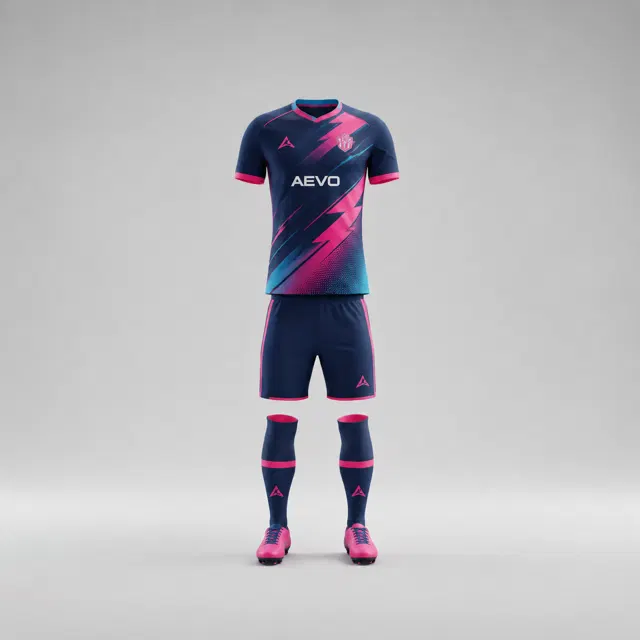
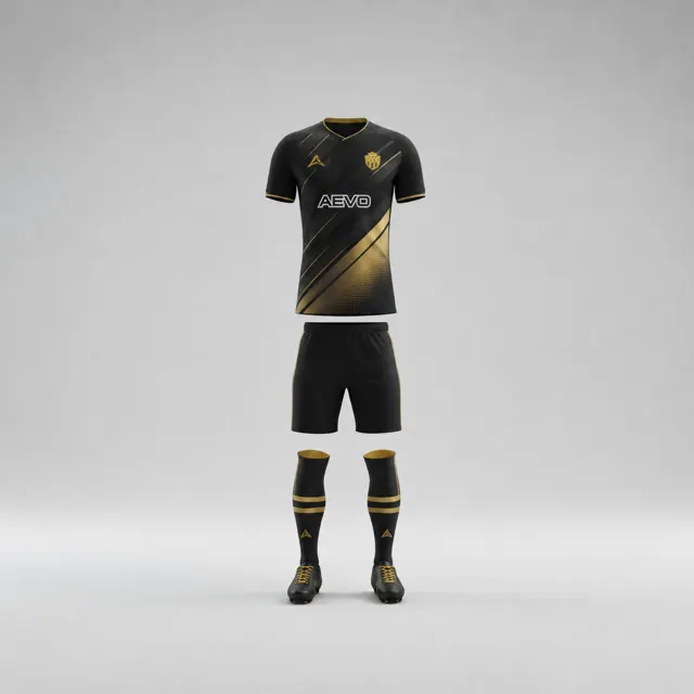
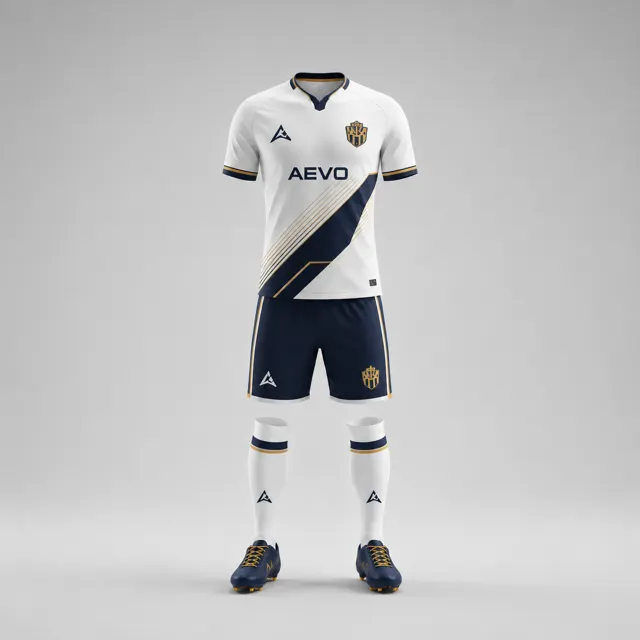
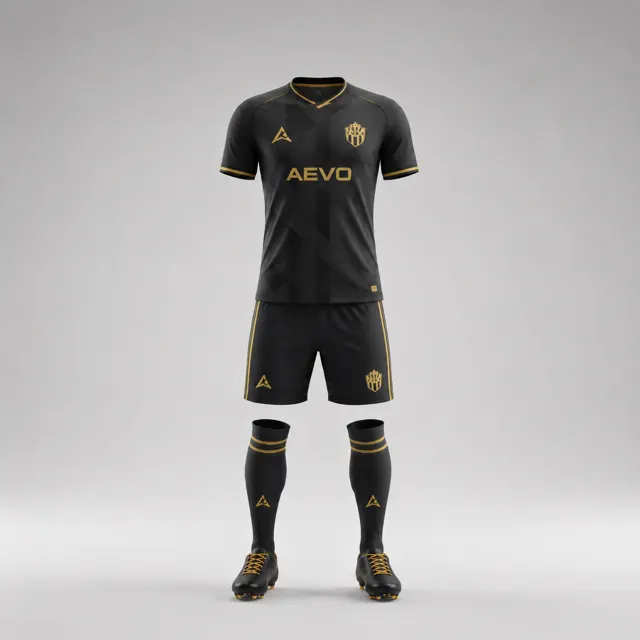
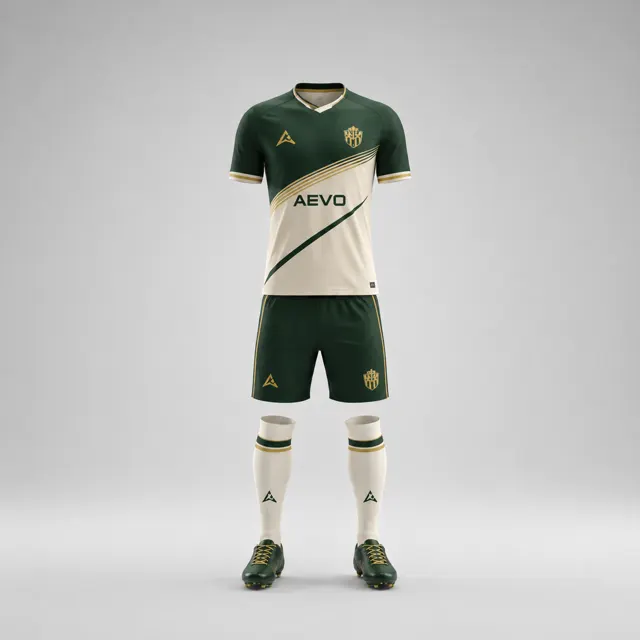
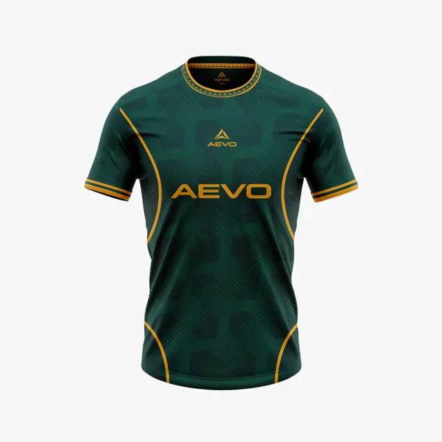
Compare colour samples on screen and in daylight before deciding
Use a simple comparison protocol for screen previews, physical samples and the club’s approved colour reference before choosing a kit shade.

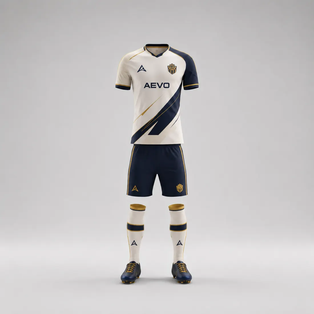
A shade that looks right on a design screen may look different on another phone, in a bright room or on a physical material. That does not make a digital mockup useless; it means the club should use it to compare direction, not treat it as a perfect colour measurement. A short review protocol can keep the decision grounded in the club’s approved reference while making differences visible before the design is signed off.
Prepare a fair screen comparison
Collect the club’s approved colour reference, if one exists, and place it beside the proposed design on the same device. Avoid comparing screenshots taken at different times or on devices with very different display settings. Turn off strong colour filters where possible, set ordinary brightness and view both concepts under similar room lighting. Note which screen was used, because a committee member’s vivid phone display may not show the same balance as a laptop.
Compare broad impressions first: does the design remain in the intended colour family, and do the light-dark relationships feel right? Then inspect smaller areas such as the crest background, a narrow trim and the number field. Do not ask the screen to prove that a final fabric shade will match exactly. The custom kit process can begin with a digital design conversation; keep the distinction between a concept and a material reference clear.
Add a physical check when available
If the supplier can provide a relevant physical colour or fabric sample, look at it in natural daylight and in the kind of indoor light where the team typically handles kit. Daylight is useful for seeing undertones, but outdoor conditions change with weather and time. Hold the sample against the approved club reference rather than relying on memory. If no physical sample is available, say so in the approval notes instead of implying that the colour has been physically verified.
A fair comparison uses the same viewing angle and neutral surroundings. Keep bright objects away from the sample; neighbouring colours can influence how a shade appears. Photographing a sample can document the moment, but the photo returns the colour problem to a screen. Use pictures for discussion, not as an exact substitute for the material.
Record what the club actually approved
Make a brief log with the reference used, screen conditions, sample status and the decision. Record the acceptable direction in plain language, such as “retain the deep blue family; keep the crest field light,” rather than promising a pixel-perfect match. Ask the designer to identify any unresolved difference and review the revised mockup with the same method. That prevents the committee from changing its standard halfway through the process.
If several people are deciding, collect their observations independently before discussing them. This helps expose whether one reviewer is responding to a screen setting rather than the design itself. The gallery may inspire layouts but cannot establish your club’s colour reference. Once the team agrees, send the notes through AEVO contact and request the next design view or quote. A thoughtful comparison produces a clearer decision, not an unsupported claim of exact colour.