Coordinate accent colours without losing the club’s identity
Compare two accent-colour approaches against the shirt base, club crest and number colour to keep a football kit coherent.

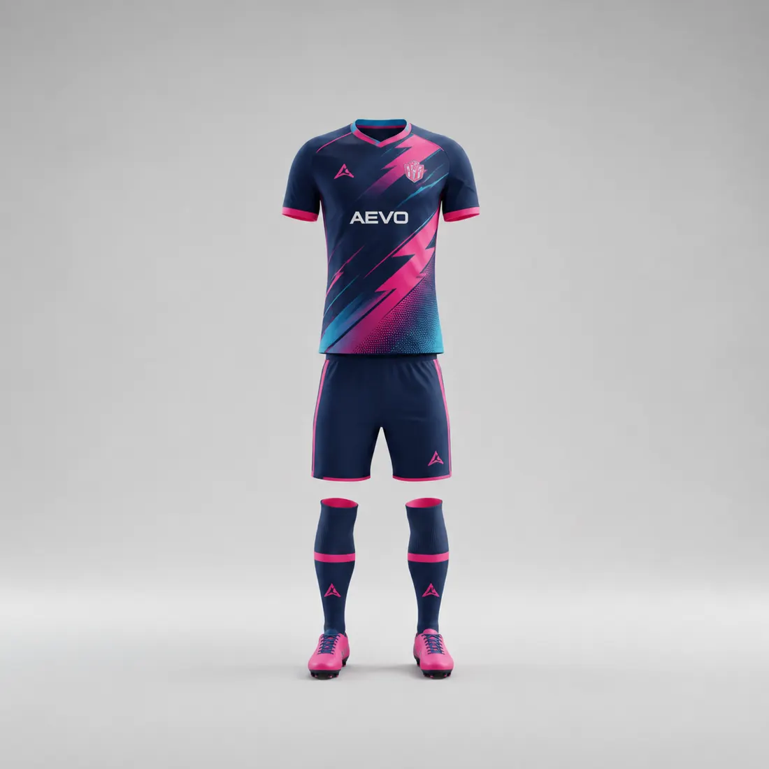
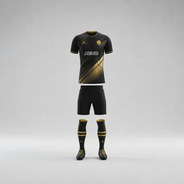
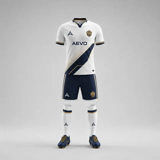
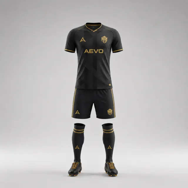
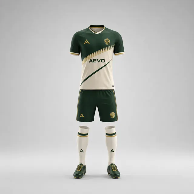
Accent colours are small by area but large in influence. A stripe, collar edge or side panel can make a football shirt feel connected to the club—or pull it in a direction the club never intended. The safest way to choose accents is to compare their relationship with three things that already matter: the shirt’s base colour, the crest and the number colour. Looking at the accent alone misses how it behaves in the design.
Set up two purposeful alternatives
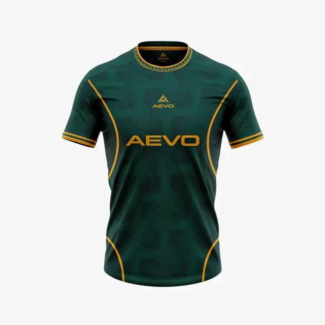
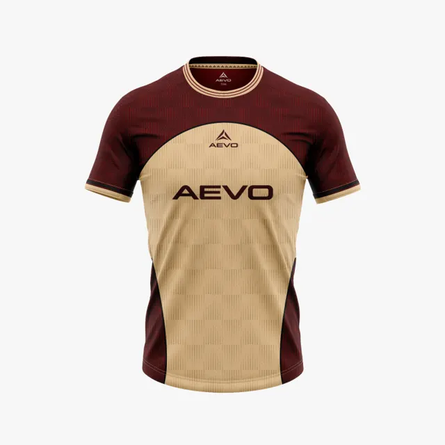
Keep the base colour and garment layout fixed, then prepare two accent approaches. The first could use a colour already present in the club identity, repeated sparingly at the collar and sleeve edge. The second could use a different supporting shade, placed on a side panel or a narrow graphic line. Avoid changing the badge, body colour and trim all at once; a controlled comparison reveals whether the accent itself improves the concept.
Give each version a short description of its role. Does it reinforce a familiar club colour, create a crisp boundary, or add energy to an otherwise calm shirt? If the answer is “a bit of everything,” reduce the number of accent placements. A colour used in several places becomes a visual signal; scattered without a rule, it can look like decoration without a reason. Browse custom kit ideas with a clear brief so the designer understands what the accent should accomplish.
Test it against the crest and numbers
Place the real crest on the mockup, at its intended size. Look at its outer edge and smaller internal details against the base colour and the nearby accent. An accent that works beside the badge may become distracting if it forms a bright field behind it. Then check the number colour where it will actually appear. A bright number on a bright accent can lose definition, even if both shades look attractive in isolation.
Try viewing the shirt in colour and in a small monochrome thumbnail. The monochrome view will not tell you whether the hues are harmonious, but it can expose weak light-dark separation. Check the name and number as part of the shirt rather than as separate sample text. Where readability matters for a competition, consult its current kit requirements instead of assuming the mockup is approved.
Choose a rule you can explain
Compare the two versions at normal viewing size, from a few steps away and in a team photograph. Ask reviewers what they notice first, whether the crest remains clear and which accent feels more like the club. Avoid deciding solely by personal favourite colour; the job is to support the whole design. If no accent clearly helps, the base and crest may already provide enough character.
Record the selected accent, where it appears and the intended number colour. This concise note gives later revisions a boundary and keeps sponsor artwork or extra trim from introducing another competing shade. For visual inspiration, the AEVO gallery shows different arrangements; it does not promise the same result on every garment. Ask AEVO for a design proposal with the two alternatives, and request a quote once the team agrees which version best represents it.