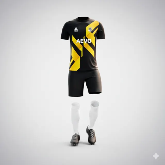
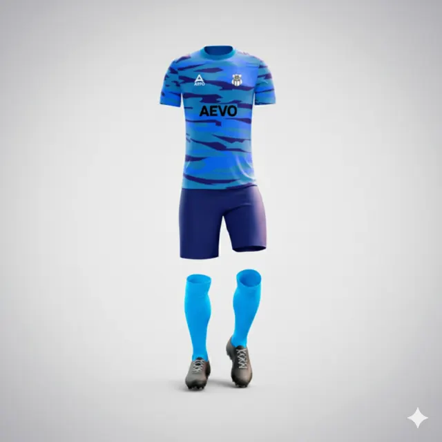
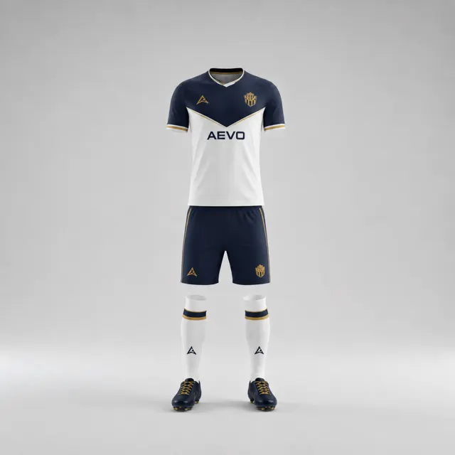
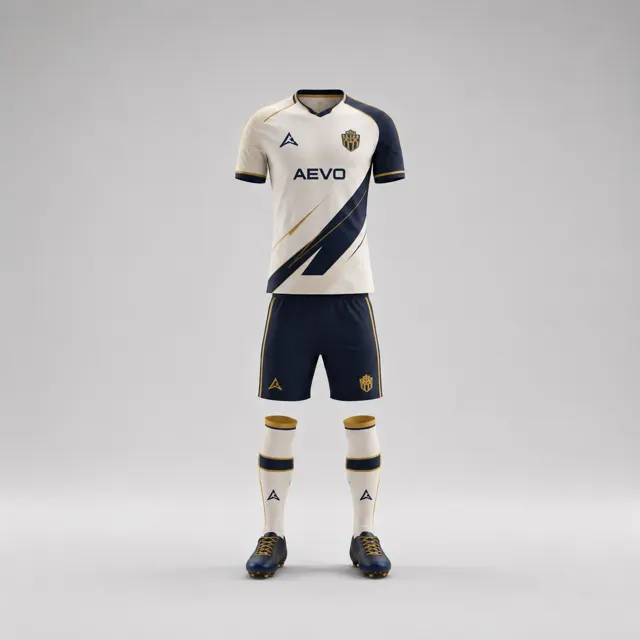
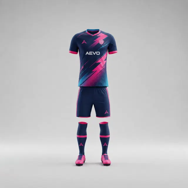
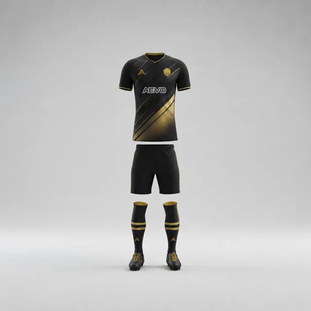
When a gradient or pattern supports a club’s visual idea
Compare a colour gradient with a repeating pattern and choose the treatment that best supports your football club’s design brief.

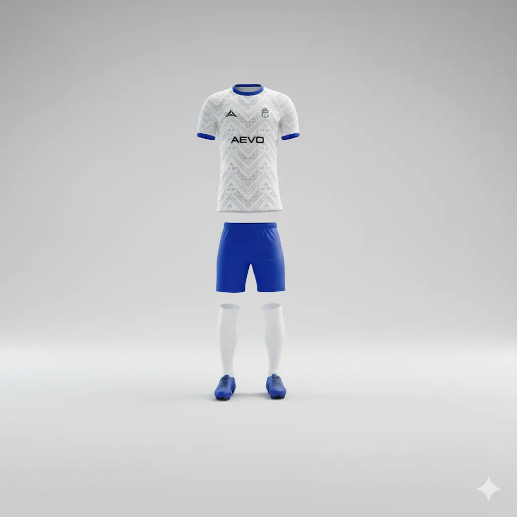
A gradient and a repeating pattern can both make a football shirt feel distinctive, but they create different kinds of movement. A gradient shifts gradually from one colour to another; a repeat builds rhythm through shapes or marks appearing again and again. Choosing between them is not a matter of which effect looks more fashionable. Start with the visual idea in the brief and ask which treatment expresses it without obscuring the club’s identity.
Translate the brief into a visual purpose
Describe the intended feeling in plain terms: calm and flowing, energetic and rhythmic, traditional with a modern edge, or something else. Then link that feeling to a design job. A gradient may help connect two club colours across a large area or give a panel a sense of direction. A repeating pattern may reference a geometric feature in a badge, echo a local motif or add texture to a simpler base. These are possibilities, not automatic meanings; the treatment should make sense for this team, not just look current.
Before adding either effect, decide which parts of the shirt must remain easy to recognise. Keep a clear place for the crest, sponsor artwork and player information. If you are preparing custom kit concepts, include those real elements in the mockup rather than judging a decorative swatch on its own. Use approved logo files and confirm permission for sponsor artwork.
Compare like with like
Ask the designer for two versions using the same base colours, garment layout and badge placement. In one, try a restrained gradient; in the other, test a repeat with a controlled scale and spacing. Comparing different colour palettes at the same time will make it difficult to identify whether the pattern or gradient is responsible for the change in mood.
Look first at the whole silhouette, then at the shirt from a closer view. A gradient can become visually flat if its transition is too subtle at a distance, while a repeat can turn into noise when its marks are too dense or numerous. Shrink both concepts to a small team-photo image and see whether the intended effect survives. Check that a crest does not disappear across a colour transition and that numbers do not sit on a busy part of the repeat. If necessary, reserve a calmer field for important details.
Choose the effect that serves the club
A simple decision test is to cover the decorative area temporarily and ask whether the remaining shirt still feels like the club. Then reveal the effect and ask whether it adds something meaningful. If the answer is only “it looks more elaborate,” simplify it or try the alternative. A restrained pattern can be more distinctive than a complicated one; a quiet gradient can connect colours without becoming the headline.
Consider how the graphic relates to shorts and any other kit pieces. Repeating the exact effect everywhere may make the outfit overly busy; using it on a single panel may create a more deliberate focal point. Look at the AEVO gallery for examples of different visual approaches, while remembering that another club’s layout cannot decide your brief.
Write down why you chose the gradient or pattern, where it belongs and which areas should stay clear. A mockup can guide visual approval but does not guarantee exact material colour or competition approval. Share the brief and notes with AEVO through contact to request a design proposal and quote. The best treatment is the one that strengthens the club’s story and still leaves the shirt readable as a team kit.