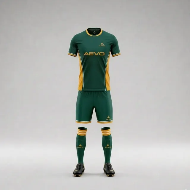
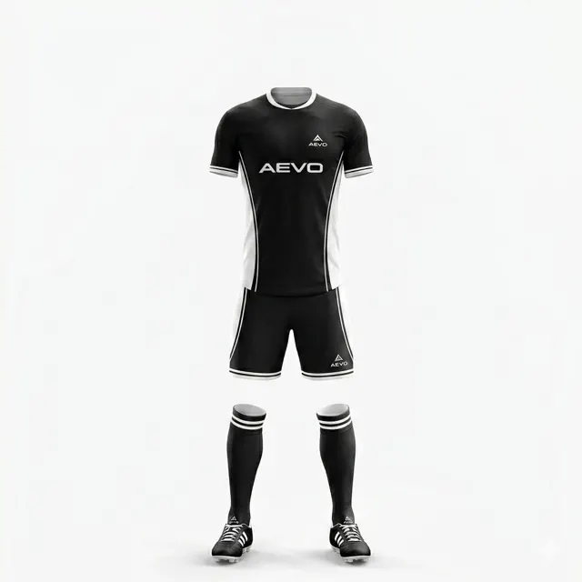
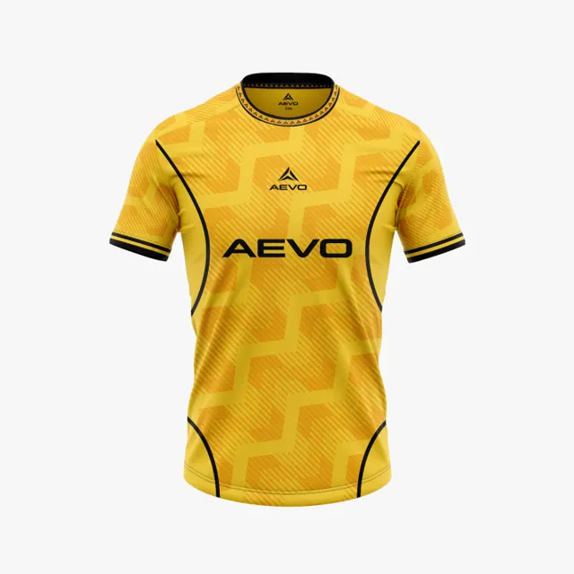
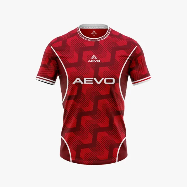
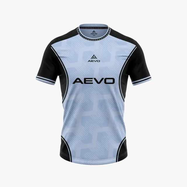
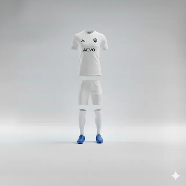
How to stop a team shirt becoming overloaded with detail
Edit a busy football shirt mock-up by choosing a focal point, removing competing details and reviewing the whole design.

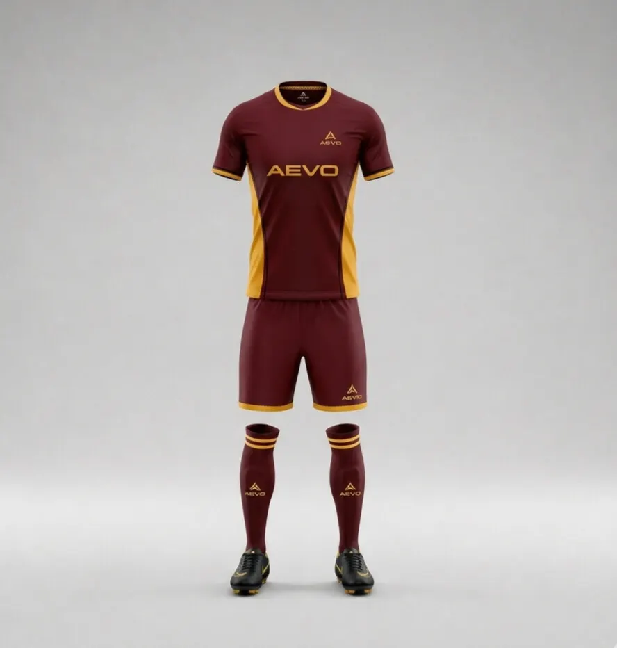
Step back before editing
When a shirt mock-up feels busy, it can be tempting to add one more detail to “pull it together.” Try the opposite: remove things temporarily. Write down what the shirt should express, then choose one principal idea that helps it do so. That might be a club colour block, a simple line or a motif tied to a verified symbol. Ask the group what they notice first when they see the design. If answers scatter across the crest, pattern, text and several accent colours, the visual hierarchy is unclear. Simplifying is not about removing personality; it is about making room for the strongest idea.
Sort details by the job they do
Review each element and ask what purpose it serves. Does it help identify the club? Make an important message easier to read? Add intentional contrast? If nobody can explain why a detail is there, mark it as a candidate for removal. Group similar elements: several thin lines may be replaced by one clearer shape, while an accent colour can go if it has no distinct role. Do not judge each detail in isolation; look at whether it competes with the crest and main colour. Compare the overall feel with different team kits, but start from your club’s own identity rather than copying another team’s look.
Use scale, contrast and space to create hierarchy
A motif does not have to disappear completely to become less dominant. It might be made smaller, moved to a smaller area or reduced in contrast so the crest and main colour stand out. Check how many high-contrast points appear on the same side of the shirt. If all text and graphics have equal visual weight, the eye has nowhere to rest. Leave blank areas deliberately: breathing room between the badge, pattern and text helps each part read. Show a simplified version beside the detailed one and ask a few players to describe the difference before revealing which they prefer. A screen is a discussion aid; colours can look different on different displays.
Test one edit at a time
Do not make five changes at once or you will not know which one helped. Duplicate the mock-up and make one version without a competing pattern; make another with more space around the crest. Compare at small scale, where the shirt reads as a whole, and close up, where text and edges become visible. Include front and back so simplifying one view does not create imbalance in the other. Record what changed and which comments led to the decision. When the simpler solution feels clearer, gather the final requests and ask AEVO for a design mock-up. Keep the original brief nearby and compare it with club kit options.