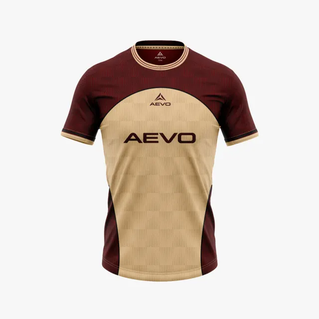
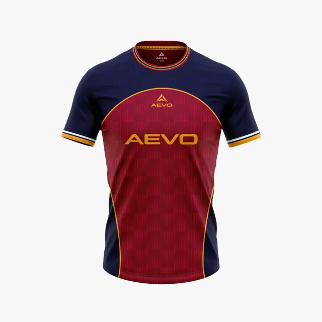
Make club colours recognisable in a new football shirt
Use the club’s documented identity colours to decide which areas of a new football shirt should carry its most recognisable shades.

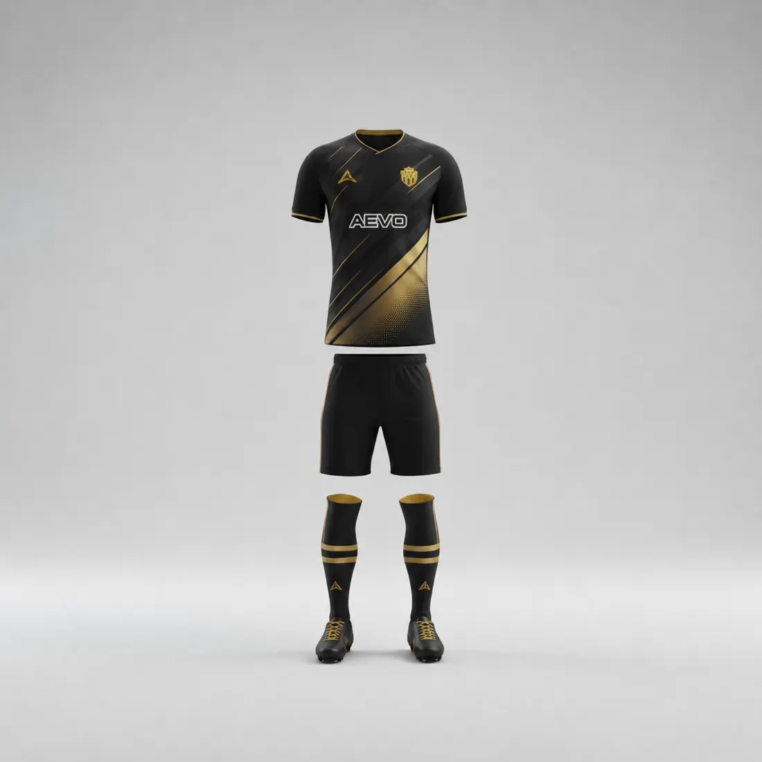
A fresh shirt can look modern and still feel unmistakably connected to the club. The key is often not inventing a new shade, but deciding where the established colours should appear and in what balance. If the shirt departs too far from the club’s own visual references, supporters may struggle to recognise it; if every colour is applied equally, the result can feel crowded. A deliberate distribution helps keep the identity visible while leaving room for a new design.
Establish which reference is authoritative
Begin with documented club colours: an identity guide, approved logo artwork, or a reference file used for previous design work. If the club has more than one version, identify the current one and note whether any historical colours remain important to supporters. A match shirt or old photograph can help explain continuity, but it should not silently overrule current approved references, since fabric and lighting affect appearance.
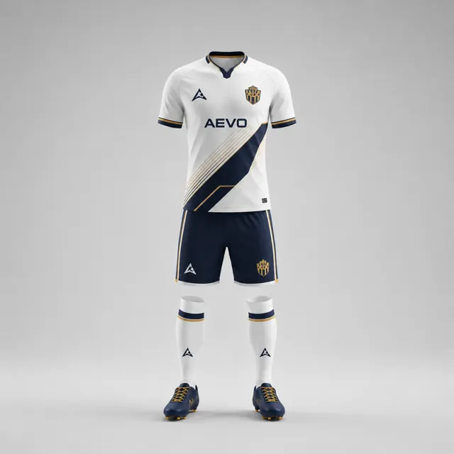
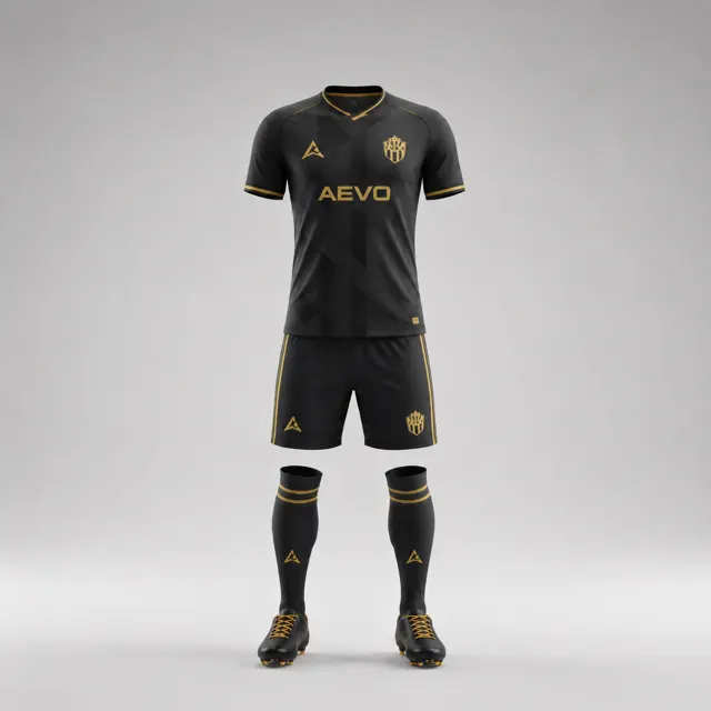
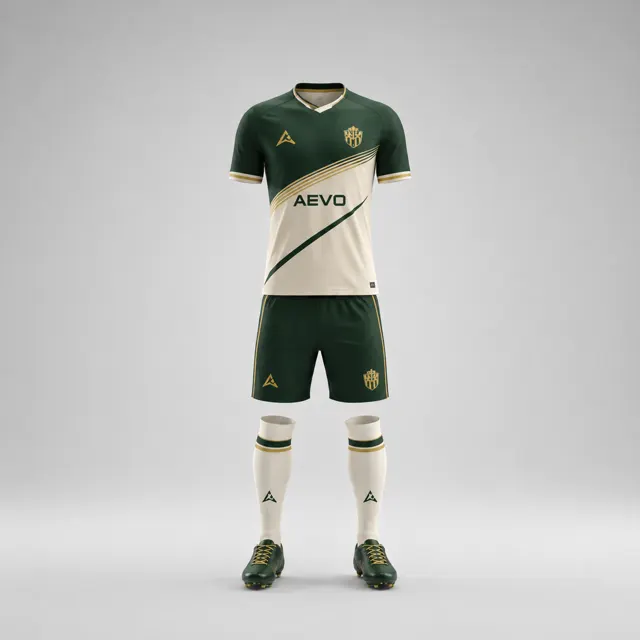
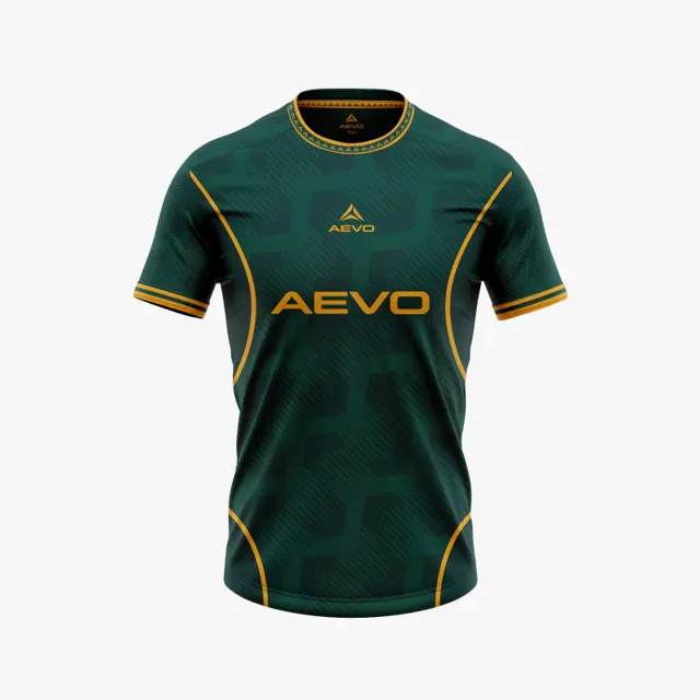
Build a small comparison sheet with the documented colours and their intended roles. Mark the primary shade, supporting shade and any neutral. Where a precise reference value exists, share it with the designer; names alone can be interpreted differently. See the available custom kit designs as garment concepts, while treating the identity reference as the source for what “club colour” means.
Decide which fields carry the identity
Look at the shirt as zones: body, sleeves, collar, side panels and small trim. You do not need every zone to carry every identity colour. A dominant body colour may be enough to make the shirt recognisable, with the secondary colour reserved for a sleeve or a narrow feature. Another design might reverse that balance on purpose, but it should still preserve a clear visual clue to the club.
Compare the proposed layout beside the current crest and a familiar club image. Ask someone who has not followed the design discussion to name the club or describe what seems familiar. If they notice only the pattern, move one established colour to a more visible area. If the identity reads clearly but the shirt feels too close to an old one, retain the key shade and change the arrangement, scale or supporting details instead.
Protect recognition at different sizes
A shirt is seen on the pitch, in a crowded team photo and as a small online thumbnail. Check the colour hierarchy at all three sizes. Tiny accents can disappear in a thumbnail, while a large contrasting panel may overpower the crest at full size. Review the badge background and any sponsor placement in context, and obtain permission for artwork supplied by sponsors or partners. The gallery can provide ideas for varied layouts, but it is not a substitute for comparing your club’s own identity.
Write down which colours must remain, which fields can change and who gives final approval. That simple record stops revisions from gradually removing the cues that made the design recognisable. Screens do not guarantee exact colour on the final material, so request an AEVO design proposal and review its details before approval. A new shirt can feel current without losing the visual memory that makes it belong to the club.