Build a useful colour palette for a football team
Build a practical team kit palette with a base, accent and neutral colour, then decide exactly where each belongs in the design.

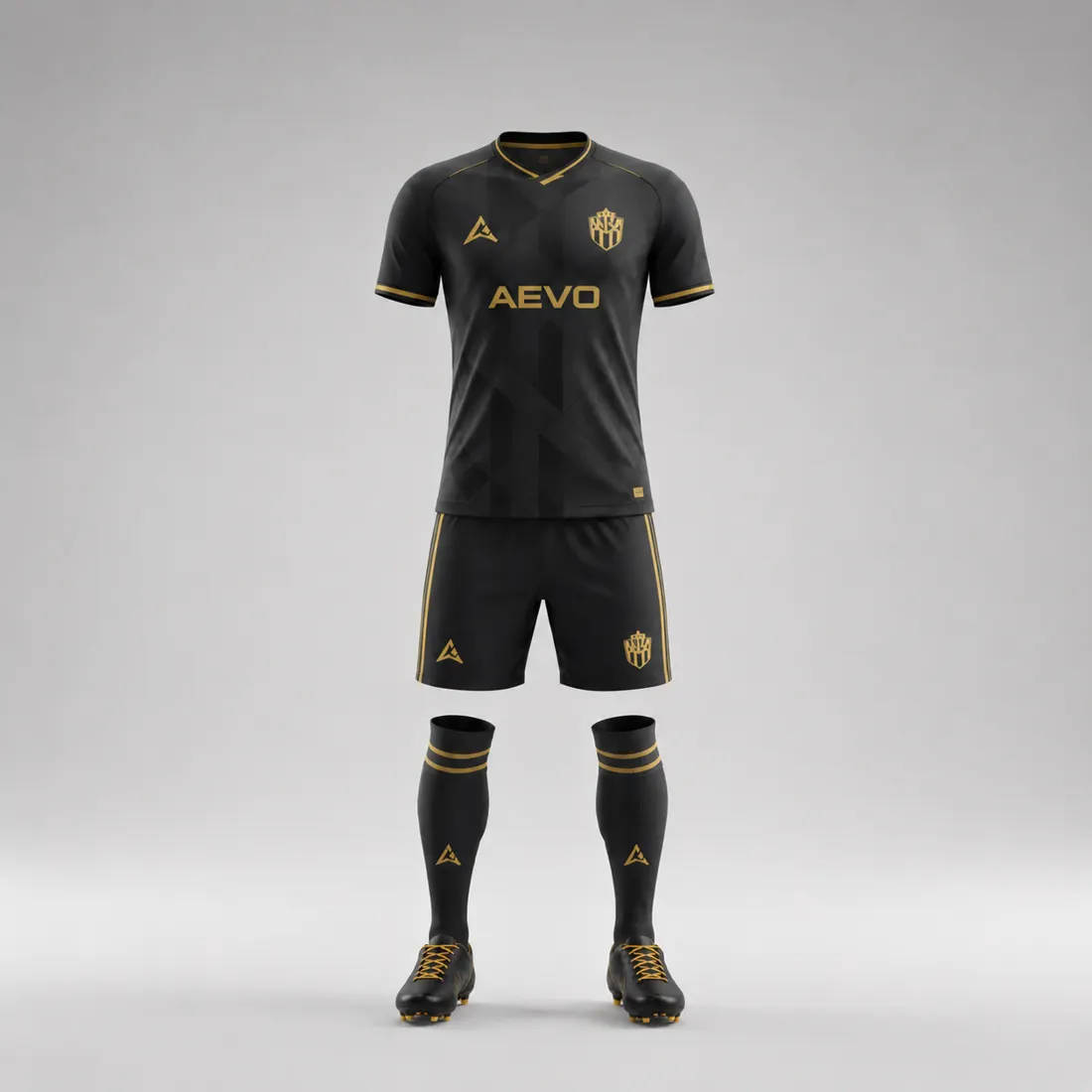
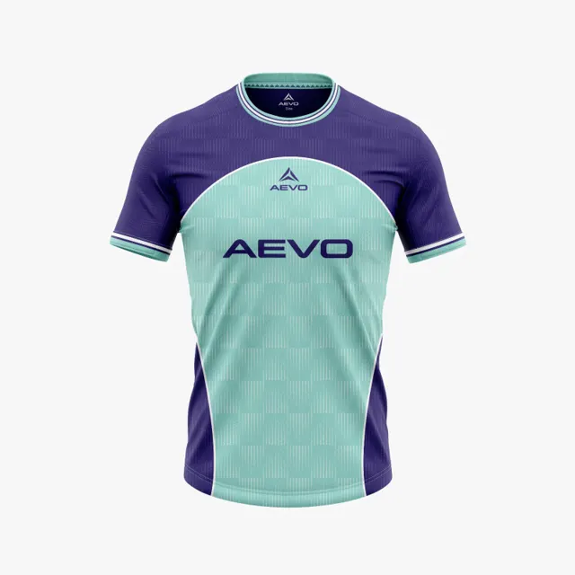
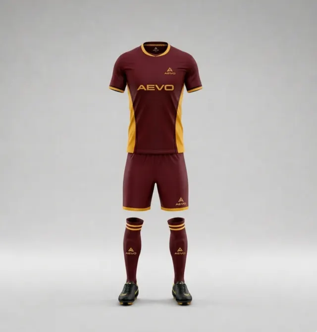
A good football kit palette is not a collection of colours the committee likes individually. It is a small system that tells a designer what should lead, what should draw attention and what should give the eye a rest. Before choosing extra shades, agree on three jobs: a base colour for the main garment area, an accent for selected details, and a neutral that can support lettering or balance the outfit.
Give each colour a clear role
Start with the base. It will usually occupy the largest area, so it should connect to the club identity and remain comfortable to see across the shirt or shorts. Pick an accent with a purpose: perhaps it echoes a secondary club colour or makes a collar, side panel or narrow trim feel intentional. A neutral, such as a restrained light or dark tone, can separate elements, support name and number artwork, or keep the overall composition from feeling busy. “Neutral” does not have to mean white or black; the important thing is that it does not compete with the base.
Write a one-line rule for each shade: where it may appear and where it should not. For example, a bright accent might be limited to small panels rather than used for every outline. These boundaries make a palette useful when several people are reviewing concepts. Explore custom kit designs with those roles in mind, rather than asking for a design that simply uses every available colour.
Check the relationships, not just the swatches
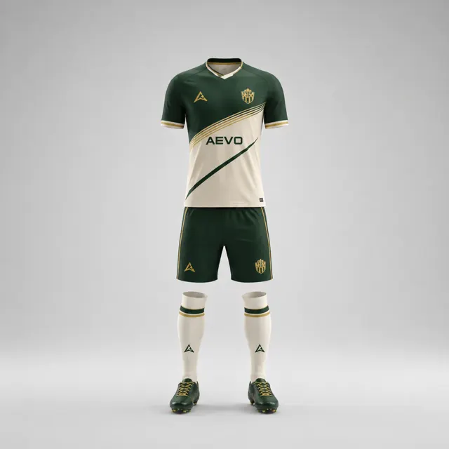
Put the three colours next to one another, then view them on a shirt and shorts. A tiny accent sample can appear subtle on a screen but become visually dominant when repeated on cuffs, shoulders and side inserts. Check the badge on the base field, and check name and number colours against the areas where they will sit. A colour combination can be attractive as a palette yet fail when important shapes touch or overlap.
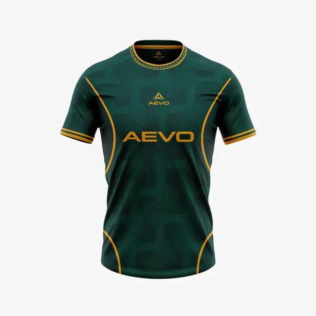
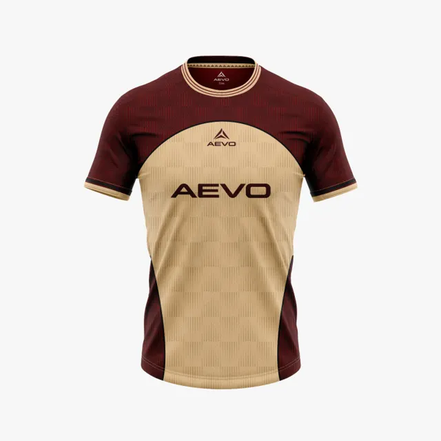
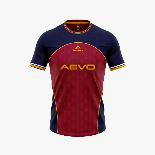
Try two versions that share the same base but use the accent differently. In one, the accent could be concentrated around the neckline and side detail; in another, it might mark a larger panel while the neutral is used sparingly. Compare the visual hierarchy: what do you notice first, and can you still recognise the club mark? If you want to see how different designs distribute their colours, use the AEVO gallery as inspiration, not as proof that a particular combination will look identical on another garment.
Make the palette repeatable
Record colour names or approved reference values when the club has them, and attach a note or image showing the intended proportions. Do not rely on names such as “royal blue” alone: people may picture different shades. If age groups or teams need variations, say which colour is fixed and which can change. That gives future kit decisions a common starting point without forcing every season into an identical layout.
Finally, look at the palette in a normal team photo and at reduced size. The base should still identify the outfit, the accent should add character rather than noise, and the neutral should do its supporting job quietly. Screens do not guarantee an exact material colour, so request a design proposal and discuss the final visual before approval. AEVO can help turn your palette and placement notes into a mockup and quote.