Shirt and shorts contrast: what to check in a football kit design
Learn to judge the visual contrast between a football shirt and shorts in a design mockup, from colour blocks to badges and trim.
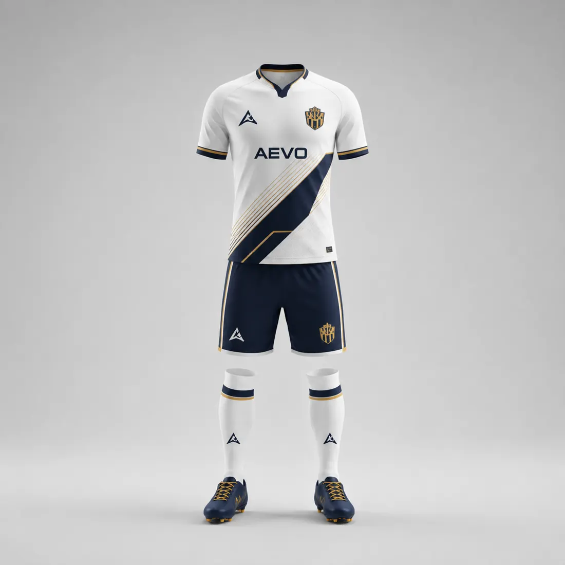
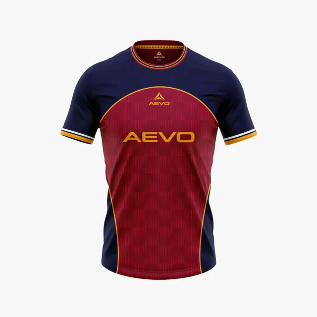
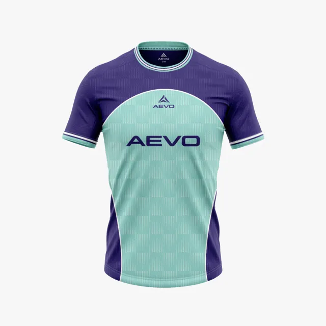
A football kit can use colours the club loves and still feel muddled when the shirt and shorts are viewed together. Contrast between the two pieces affects how the outfit reads as a whole: it can create a clear division, make one area lead, or bring balance to a bold shirt. Reviewing this relationship on a design mockup is more useful than approving the garments separately.
Look at the silhouette before the details
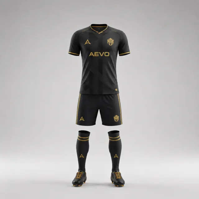
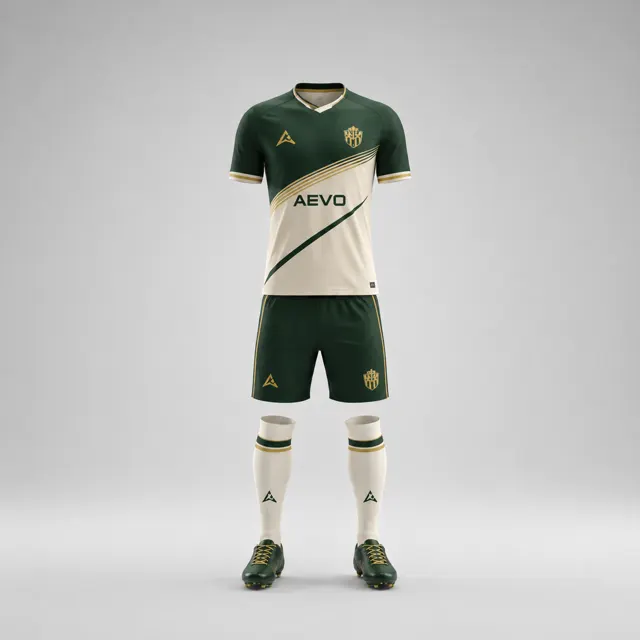
Start by placing the full figure or flat garment drawings side by side at the same scale. Squint slightly or step back from the screen. If the shirt and shorts merge into one large block, the kit may need a clearer separation; if they look unrelated, a shared colour detail could connect them. This first glance helps identify the overall rhythm before attention is drawn to badges, numbers or piping.
Try a simple grayscale view as a diagnostic, not as a replacement for colour review. If the shirt and shorts become nearly identical shades of grey, they may rely heavily on hue alone to read as separate pieces. That is not automatically a problem, but it is worth testing in different light and against a range of backgrounds. Then return to colour and see whether the contrast feels deliberate rather than accidental.
Compare a few controlled combinations
Keep the shirt fixed while changing the shorts, or keep the shorts fixed while testing shirt options. This isolates the effect of the change. A dark shirt with a lighter short can create a strong break; a light shirt with a deeper short can feel grounded. Two close shades may produce a quieter, more unified appearance, especially if a narrow accent repeats between garments. Consider whether socks are part of the same visual sequence, but do not let them distract from the shirt-to-short relationship you are evaluating.
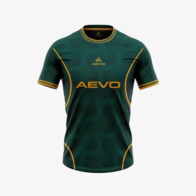
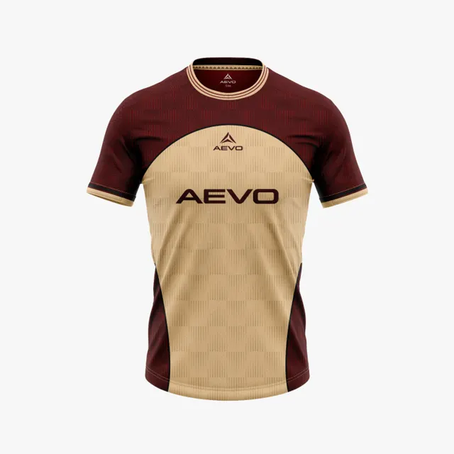
Check the club crest and any sponsor artwork in their actual positions. A high-contrast shirt panel may draw attention away from the crest, while a busy short colour can make the lower half visually heavy. Look at the outfit as a small image, as it might appear in a match announcement. Use the AEVO kit gallery for ideas about colour distribution, and review the available custom kit choices when deciding which garment areas can support the concept.
Agree what “balanced” means for your team
Not every club wants the same outcome. Some want a recognisable, high-energy split; others prefer a restrained look that makes the badge the main point of focus. Write one sentence describing the intended effect before giving feedback. It turns comments such as “the shorts feel wrong” into something a designer can act on: perhaps the lower half should be lighter, or the trim should repeat a shirt accent.
Remember that a mockup helps compare design, not certify a competition uniform or promise exact colour on fabric. If match regulations matter, check the organiser’s current requirements separately. Gather the preferred version and specific notes, then request an AEVO design proposal. A thoughtful shirt-and-shorts contrast makes the kit feel considered from first glance to the details.