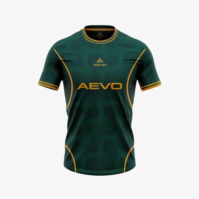
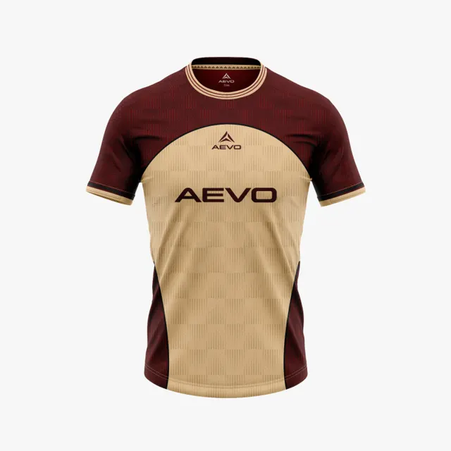
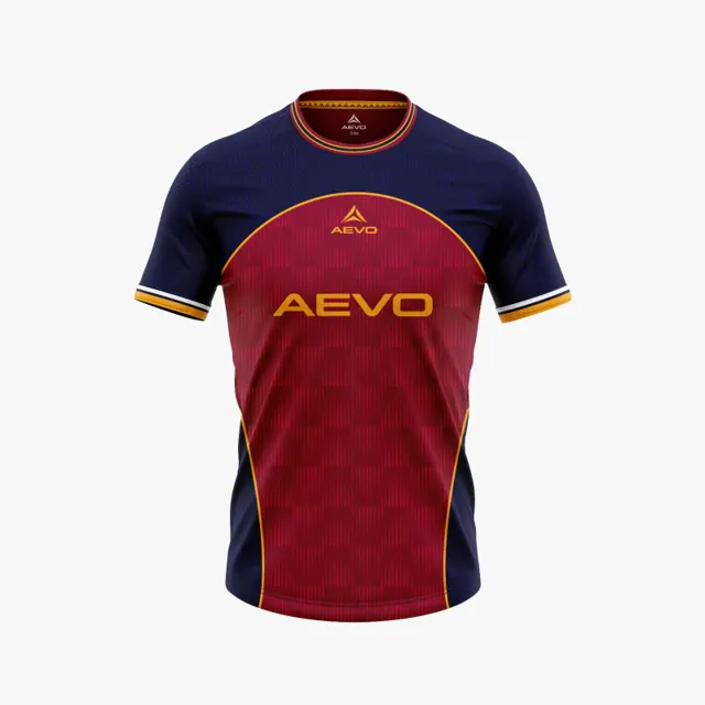
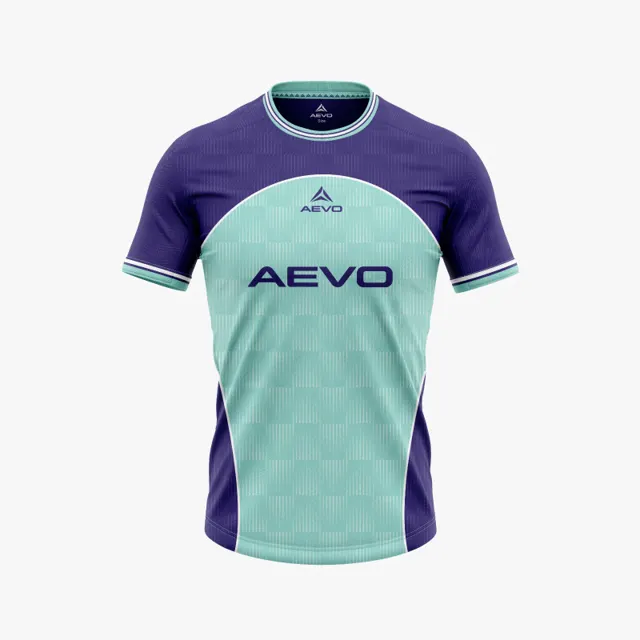
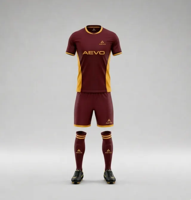
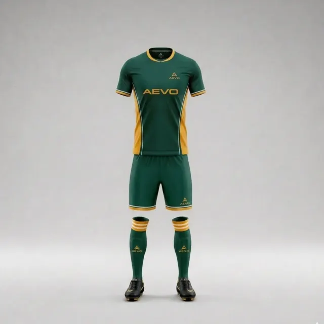
Choose a primary colour that feels like your football club
A practical way to test your club’s main colour across shirt, shorts and crest backgrounds before approving a custom football kit design.

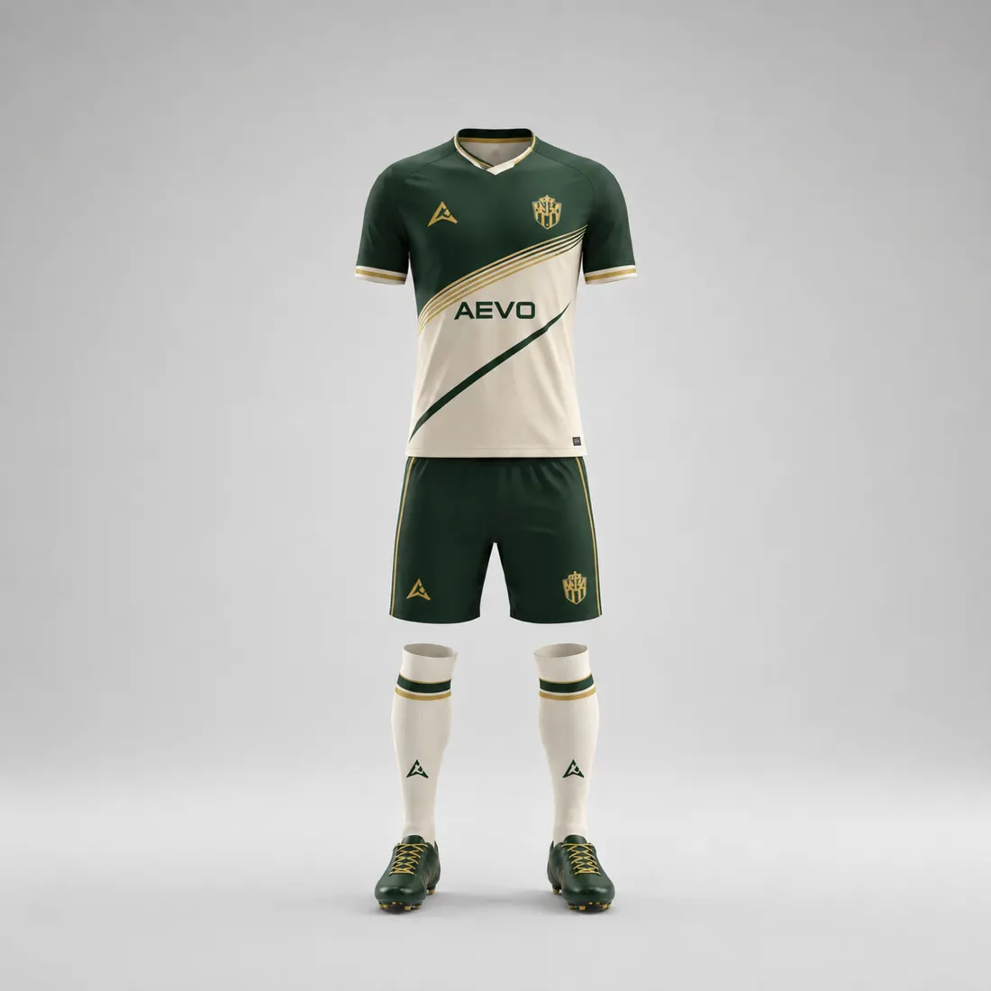
A club’s main colour is more than a swatch on a design screen. It is the thread supporters recognise from the touchline, in a team photograph and on a shirt pulled from the kit bag. When you are choosing a new football kit primary colour, the useful question is not simply “Do we like this shade?” It is whether that colour still feels like your club when it moves across the whole outfit.
Start with the club’s own reference
Gather the most reliable references you have: a current badge file, an existing kit that the club considers representative, and any written colour guidance. Old social posts and phone photographs can be helpful for history, but lighting, compression and ageing fabric can change what a colour appears to be. If the club has no formal identity guide, agree which source has priority before comparing fresh shades. This avoids a late debate in which different committee members are unknowingly comparing different versions of the same “blue.”
Write down what the main colour needs to do. Perhaps it should preserve a long-standing identity, give a newly formed side a clear look, or connect junior and senior teams. Keep that purpose visible while reviewing concepts. Browse custom football kit options to see the garment context, but treat a screen preview as a design conversation rather than a colour guarantee.
Test the colour on the whole outfit
Ask to see the proposed colour on the shirt, shorts and socks where applicable, not only as a large rectangle. A shade that looks confident across the chest may dominate the shorts or make a small crest feel lost. Compare two or three sensible distributions: main colour across shirt and shorts; main colour on the shirt with a calmer short; or a balanced split that lets the badge stand out. Keep the first review focused on the primary colour instead of changing every trim detail at once.
Also inspect the crest against each proposed field. Look at its outline, lettering and small shapes, not only its overall silhouette. If a crest disappears into a similar background, try a different panel placement or a restrained contrasting field rather than altering the club mark casually. Any crest or sponsor artwork should be supplied with permission for use.
Make a simple approval test
Put the concepts side by side at the same scale. Review them on a normal laptop or phone, then look from a few steps away and in a small team-image thumbnail. Ask people who do not know the design which version they identify with the club, and what caught their eye first. This is not a scientific vote; it is a way to find whether the intended identity reads quickly.
Record the chosen shade, where it appears, the alternate colour for shorts, and any unresolved badge contrast. That short decision note helps the designer make revisions without reopening settled questions. Colours can look different on screens and physical materials, so request a design proposal and confirm the final visual against the production information before approval.
A primary colour is working when it carries the club’s character without competing with its badge or making the outfit feel unbalanced. If you want to compare a direction for your team, share the identity references and request an AEVO design mockup and quote.