Choosing kit colours when many people need to see themselves in them
Help players, coaches and club decision-makers compare colours using shared criteria. This simple exercise makes the choice clearer for everyone.

When a new kit involves a whole club, colour discussions can turn into a contest between personal favourites. One person wants a darker shirt, another wants a familiar accent, and the coach is thinking about visibility on the pitch. A more useful conversation starts by asking everyone to judge the options against the same criteria. That moves the decision away from whoever speaks loudest and towards what the team actually needs.
Agree what the colours need to do
Bring together a small mix of players, coaches and club decision-makers. Before looking at designs, agree on three or four shared priorities. For example, the home kit should feel recognisable as the club, names and numbers should be easy to distinguish, and the shirt should work with the chosen shorts and socks. If members care strongly about a historic colour, include that as a priority too. Keep the list short enough that people can remember it while comparing.
Separate requirements from preferences. A practical requirement may be that a number remains readable against its background. A preference may be for a particular accent colour. If the team plays in an organised competition, check any applicable kit requirements with the organiser rather than assuming one colour combination is always acceptable.
Compare like with like
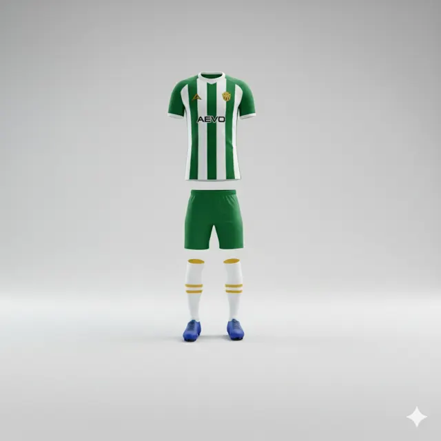
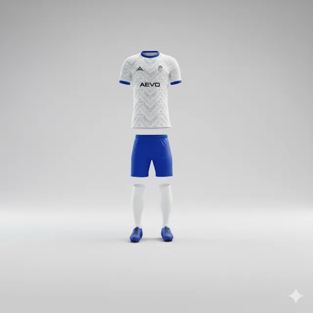
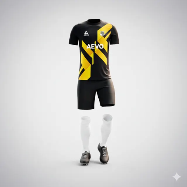
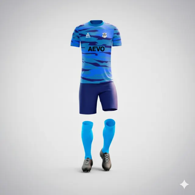
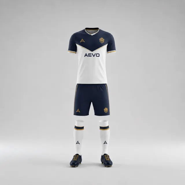
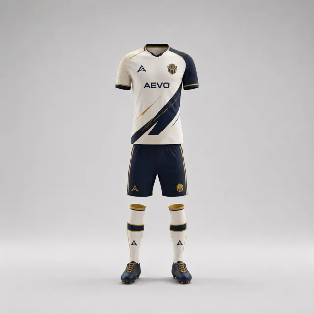
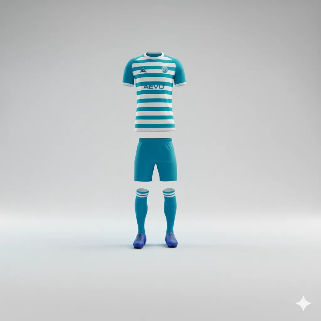
Choose two or three genuinely different colour directions instead of presenting a dozen near-identical shades. Where possible, show each as a complete outfit: shirt, shorts and socks. Ask people to score each option against the agreed criteria, first individually and then as a group. A simple one-to-five scale can show where opinions differ, but leave room for a short explanation. The number records a judgement; the comment reveals the reason behind it.
View the proposals both at normal size and as small images. Ask whether the main colour still leads, whether the crest and numbers remain distinct, and whether secondary details feel balanced. A screen is a comparison tool, not a promise of the exact eventual textile shade. Ask the supplier how colours are handled for the particular product and design process under discussion.
Turn disagreement into useful information
If the group splits, return to the shared criteria before inventing a fourth option. Ask people who favour different proposals to identify the priority their choice serves best. One option may carry the club’s tradition; another may make numbers clearer. That discussion could suggest a compromise, such as keeping one colour as the base and reserving the other for a controlled accent. A compromise should address the actual disagreement, not simply combine every request until the shirt becomes busy.
Write down the decision in a few sentences: which priorities mattered most, which direction moves forward, and what needs to be checked on the next draft? People who missed the meeting can then understand the reasoning. Browsing different team kit designs may help the group discuss something concrete rather than abstract colour names.
Confirm the direction before ordering
Ask the designated approvers to review one consolidated draft showing the colours, crest and other requested elements. Invite them to check the points the group agreed on instead of reopening every preference. To compare possible visual directions with a supplier, contact AEVO through the contact page and request a free design proposal or quote. A shared exercise will not eliminate differences in taste, but it can make the club’s final decision understandable, deliberate and easier to stand behind.