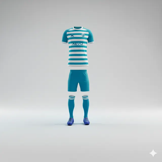
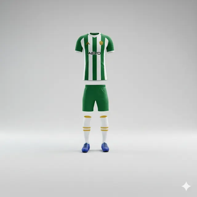
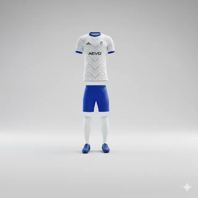
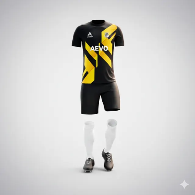
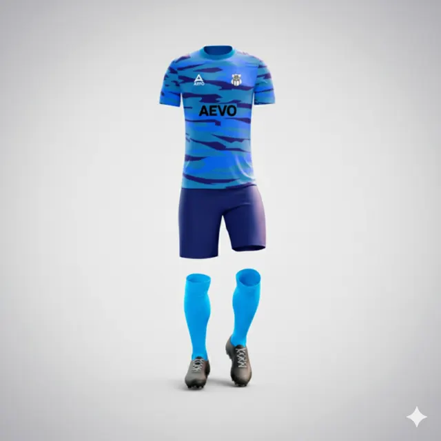
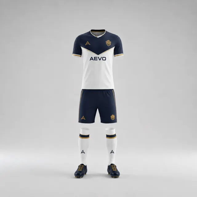
Check how the club crest colours work against the shirt background
Check whether the club crest stands out on every proposed shirt colour. Compare contrast, approved logo versions and placement before sign-off.
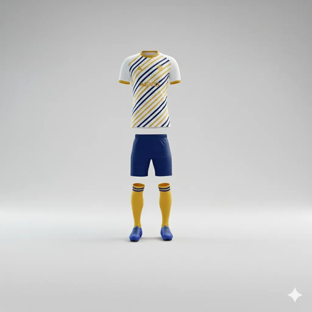
A well-designed club crest can still disappear when it sits on the wrong shirt background. A mockup that looks clear on a white screen may lose contrast against a dark or patterned panel. Review the crest against every proposed shirt colour, not only the first version shown. This gives the design group a precise question to resolve before it approves the artwork.
Look at the crest in context
Place the crest on the actual shirt proposals, at roughly the size and location under consideration. First view the whole shirt from a distance: can you find the crest without it competing with a large graphic, sponsor mark or number? Then zoom in on small details such as narrow outlines, fine lettering and colours close to the background tone. A logo does not exist on a blank rectangle; its placement brings it near seams, panels and other design elements.
Compare front and sleeve views if more than one location is being considered. Assess every shirt colour separately. A dark outline may read well against a light chest but become difficult to distinguish on a dark sleeve. A pattern beneath the crest can also interrupt its edges, even if the basic colours seem different enough.
Ask about approved logo versions
Check with the club’s responsible person whether there is an official version for dark backgrounds, a one-colour treatment or a file with a lighter outline. Do not alter the crest yourself and assume the change is acceptable. Variants can involve more than simply reversing colours, so confirm who is authorised to approve them. If the club has only one file, share that original with the supplier and ask what options could work with the proposed shirt.
A simple comparison sheet can show the same approved crest against three backgrounds. Label the logo version and note when mockup colours are illustrative. Then reviewers can judge contrast rather than guess what a fuzzy screenshot is meant to show. Keep the crest artwork unchanged in the comparison unless the club has authorised another version.
Check the whole composition
Good contrast alone does not settle whether the crest is a suitable size or in a sensible position. Leave visual space around it and check that it does not collide with sponsor artwork, a seam or the shirt’s main pattern. If you are uncertain, compare two or three distinct placements on the same design instead of mixing several changes at once. Explore team kit styles for reference and send design questions through the contact page.
Once a combination works, have a named club approver confirm the exact crest version and background on the consolidated draft. To get the options presented for review, ask AEVO for a free design proposal or quote. Send the original file and identify the shirt colours under consideration; a screen preview should not be treated as a guarantee of the exact printed colour. A deliberate contrast check helps the crest become a clear part of the kit rather than a feature that is present but hard to see.