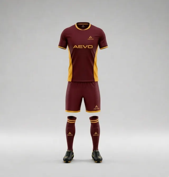
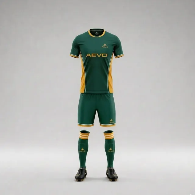
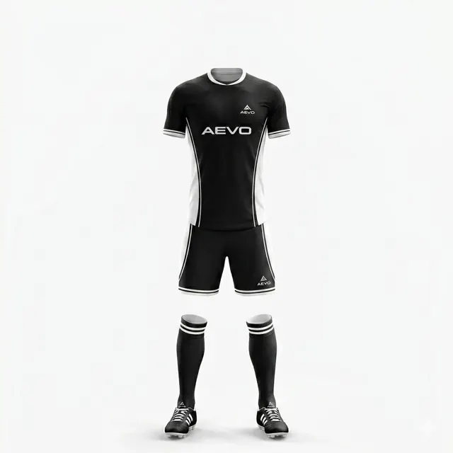
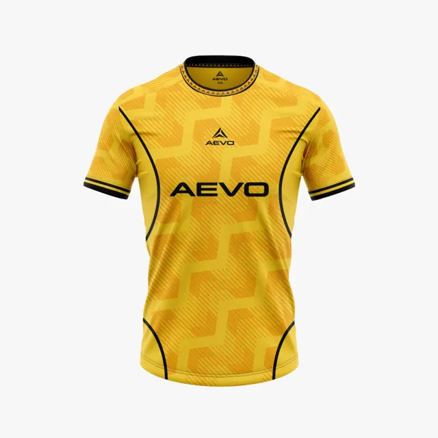
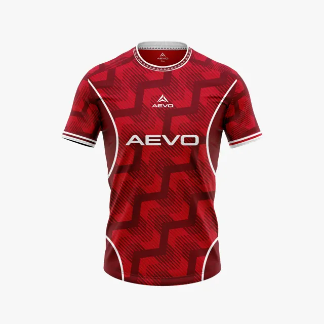
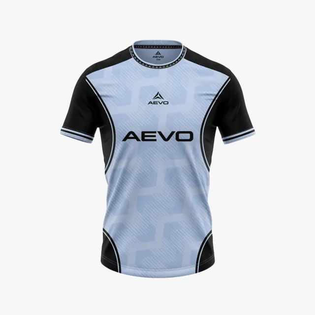
Check scale, edges and text in a zoomed shirt mock-up
Use a zoomed mock-up to inspect small text, logo scale and pattern edges before your team signs off a football shirt design.
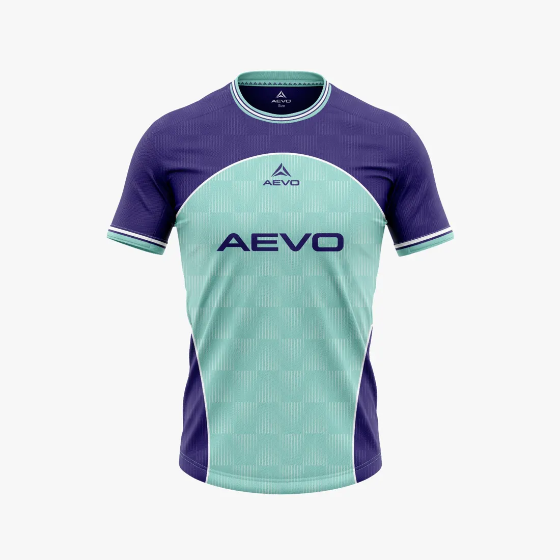
Review the whole design before zooming in
When a team shirt mock-up feels finished, it is easy to approve it from the large image on screen. Use a two-stage check instead: assess the overall impression at normal size, then zoom into critical areas. The full view shows whether the club colours and crest have the right visual weight; a close-up can reveal issues hidden at first glance. Choose a few checkpoints and repeat them for each revision. That keeps the review consistent and stops the group getting lost in random details. Remember that a digital mock-up is a decision aid, not a sample of exact colour, fabric or final placement.
Read small text aloud and in context
Check spelling in the club name, sponsor wording, numbers and any other text that is actually meant to appear. Read it slowly, character by character, and compare it with the approved original. Small lettering can become hard to distinguish when contrast is weak or it sits beside a decorative line. Ask whether the text is intended to be legible at the final size or is only a placeholder in the mock-up. Zooming helps uncover a typo, but extreme magnification may give a false sense of how large the element will feel. Judge the same text close up and at the scale at which the shirt is normally viewed.
Compare logo scale and clear space
Look at the logo in relation to the chest, sleeve or other area where it is meant to sit. Does the proportion seem intentional? Does the mark keep its shape? Is it visually separated from a pattern or seam in the mock-up? Confirm that the file is the version approved by the club and that the club has permission to use it. A logo reduced too far may lose detail; an oversized one may compete with other important features. There is no universal size for every product, so do not turn a screen image into a fixed centimetre rule. Ask for guidance on preparing the artwork and position for the next stage.
Trace pattern edges across the available views
Zoom in where graphic shapes meet: at a side seam, shoulder, sleeve end or colour transition. Look for an unexpected gap, a narrow strip of background or an edge that seems not to follow the form. It may be a rendering effect or a deliberate choice, so describe what you notice and ask before demanding a change. Check whether line width and direction carry through front and back if the design is meant to connect. Share cropped examples with a short explanation, not an unexplained arrow. Compare other team kits to help describe the style you like, then contact AEVO with consolidated feedback or to request a design mock-up.