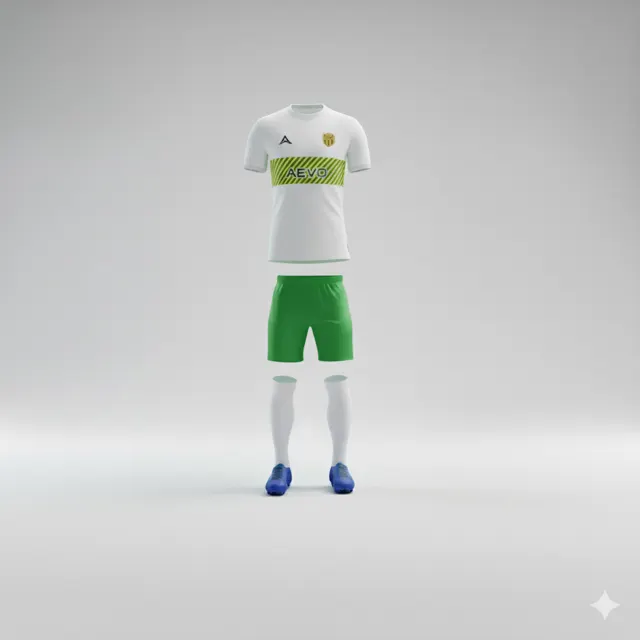
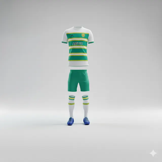
Turn your club’s ideas into concrete football-shirt design requests
Translate ideas such as tradition, energy and local pride into colours, lines and placements when briefing a football-shirt design.

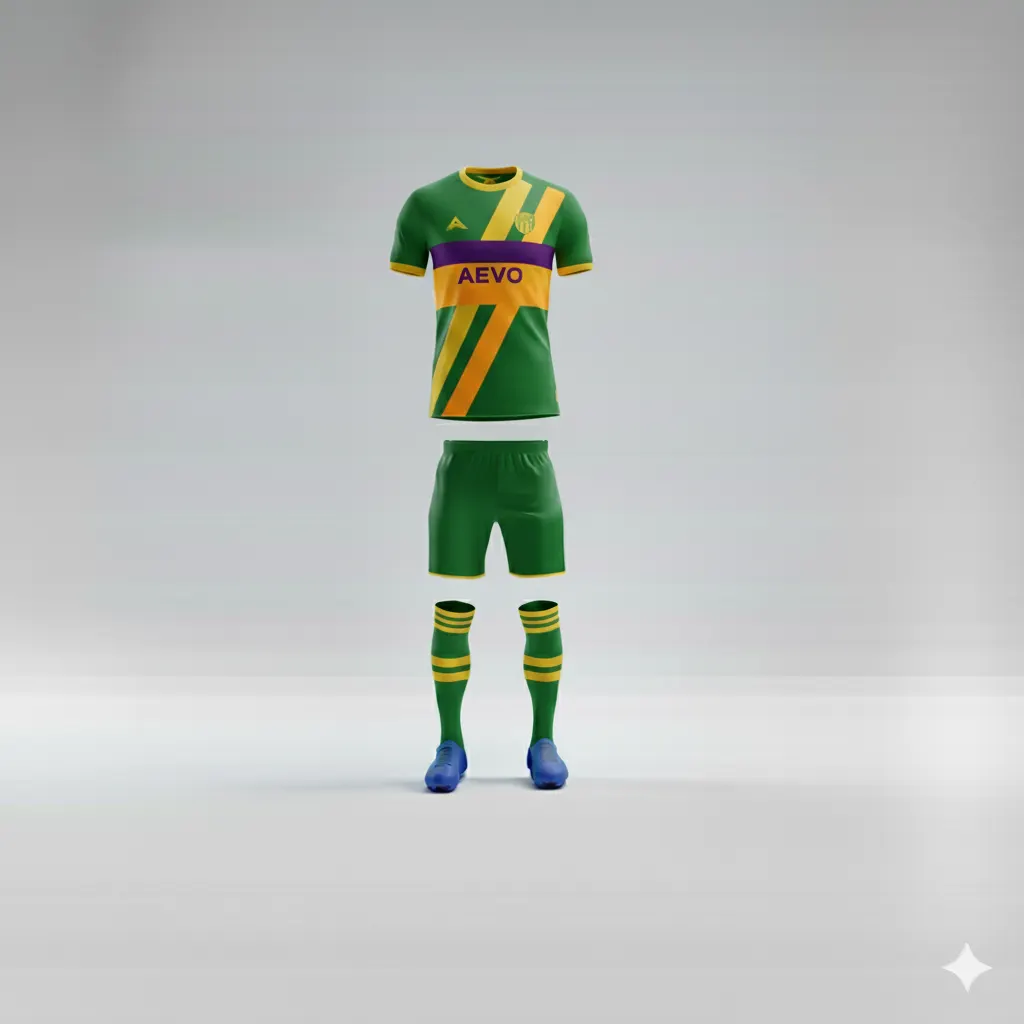
When a club says its shirt should feel “proud”, “fast” or “traditional”, that is a direction rather than a finished design instruction. First translate the feeling into a visual cue, then discuss whether it works on a garment. Exploring two clear interpretations is usually more useful than trying to include every idea at once.
Find out why the idea matters
Ask what the word means in the club’s own context. “Tradition” could refer to a long-used colour, a local symbol or a simple silhouette. “Energy” may describe how the team plays; it does not necessarily mean the garment needs lightning bolts or loud effects. Asking about the memory or feeling behind a word helps avoid the first cliché that comes to mind.
Convert the feeling into choices people can review
Turn each idea into one or two design decisions. Pride might mean giving the crest clear space; movement could be suggested by directional lines; unity might appear as a recurring colour block. Ask the group to choose a main feature and decide what should stay subtle. When every element carries an equally strong message, it becomes hard to tell what the shirt is meant to say.
Judge it on the garment, not only on a moodboard
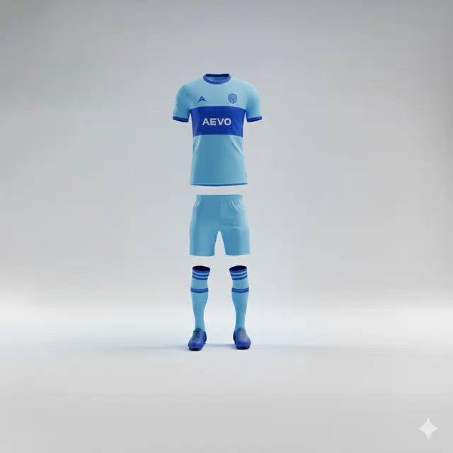
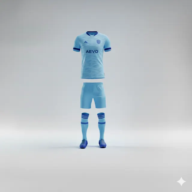
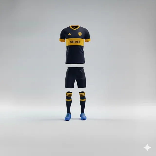
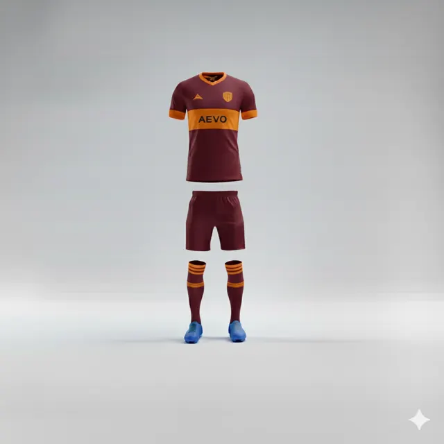
A motif that works on a poster may look busy when it bends over a shoulder or competes with personalisation. Review the mock-up views available and check whether key club elements remain distinct. Do not add tiny details just because they look visible on a large monitor. Screen colours may also differ from how colours appear in person.
Keep feedback tied to decisions
Ask players and staff the same focused questions: Does this feel like our club? Can we read the important elements? What should be simplified? Gather responses into one set of feedback instead of treating every comment as a new brief. Browse teamwear and send a clear direction through contact to request a design proposal.
Test the idea before the group commits to it
Take one abstract word and try it against two contrasting visual directions. If the club wants to express tradition, compare a restrained base with a more contemporary interpretation that still retains a familiar club colour. Ask what feels connected to the club’s history and what is merely decorative. Likewise, “energy” might come from direction and contrast rather than adding more graphic elements. A comparison makes it easier to remove details that do not support the idea. Then capture the decision in one sentence for the brief: which quality should lead, what detail supports it and which area should remain calm. That is more useful for the next mock-up than a long list of adjectives. Leave room to reconsider once the direction is seen on the actual garment rather than only on a screen.